Lecture Notes 1
Kevin R Foster, CCNY, ECO B2000
Fall 2013
Preliminary
We begin with
"Know Your Data" and "Show Your Data," to review some of
the very initial components necessary for data analysis.
You might want to
view online video 1; that covers similar basic information about measures of
the data center such as mean, median, and mode; also measures of the spread of
the data such as the standard deviation.
Those notes are the middle part of this lecture. In class we will skip right to Lecture 2,
where we apply these basic measures to learn about the PUMS dataset.
The
Challenge
Humans are bad at
statistics, we're just not wired to think this way. Despite – or maybe, because of this,
statistical thinking is enormously powerful and it can quickly take over your
life. Once you begin thinking like a
statistician you will begin to see statistical applications to even your most
mundane activities.
Not only are humans
bad at statistics but statistics seem to interfere with essential human
feelings such as compassion.
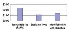
"A study by Small, Loewenstein,
and Slovic (2007) … gave people leaving a psychological experiment the
opportunity to contribute up to $5 of their earnings to Save the Children. In
one condition respondents were asked to donate money to feed an identified
victim, a seven-year-old African girl named Rokia. They contributed more than
twice the amount given by a second group asked to donate to the same organization
working to save millions of Africans from hunger (see Figure 2). A third group
was asked to donate to Rokia, but was also shown the larger statistical problem
(millions in need) shown to the second group. Unfortunately, coupling the
statistical realities with Rokia’s story significantly reduced the
contributions to Rokia.
A follow-up experiment by Small et
al. initially primed study participants either to feel (“Describe your feelings
when you hear the word ‘baby,’” and similar items) or to do simple arithmetic
calculations. Priming analytic thinking (calculation) reduced donations to the
identifiable victim (Rokia) relative to the feeling-based thinking prime. Yet
the two primes had no distinct effect on statistical victims, which is
symptomatic of the difficulty in generating feelings for such victims." (Paul Slovic, Psychic Numbing and Genocide,
November 2007, Psychological Science Agenda,
http://www.apa.org/science/psa/slovic.html)
Yet although we're
not naturally good at statistics, it is very important for us to get
better. Consider all of the people who
play the lottery or go to a casino, sacrificing their hard-earned money. (Statistics questions are often best illustrated
by gambling problems, in fact the science was pushed along by questions about
card games and dice games.)
Google, one of the
world's most highly-regarded companies, famously uses statistics to guide even
its smallest decisions:
A designer, Jamie Divine, had picked
out a blue that everyone on his team liked. But a product manager tested a
different color with users and found they were more likely to click on the
toolbar if it was painted a greener shade.
As trivial as color choices might
seem, clicks are a key part of Google’s revenue stream, and anything that
enhances clicks means more money. Mr. Divine’s team resisted the greener hue,
so Ms. Mayer split the difference by choosing a shade halfway between those of
the two camps.
Her decision was diplomatic, but it
also amounted to relying on her gut rather than research. Since then, she said,
she has asked her team to test the 41 gradations between the competing blues to
see which ones consumers might prefer (Laura M Holson, "Putting a Bolder
Face on Google" New York Times, Feb 28, 2009).
Substantial
benefits arise once you learn stats.
Specifically, if so many people are bad at it then gaining a skill in
Statistics gives you a scarce ability – and, since Adam Smith, economists have
known that scarcity brings value. (And
you might find it fun!)
Leonard Mlodinow,
in his book The Drunkard's Walk,
attributes the fact that we humans are bad at statistics as due to our need to
feel in control of our lives. We don't
like to acknowledge that so much of the world is genuinely random and
uncontrollable, that many of our successes and failures might be due to
chance. When statisticians watch sports games,
we don't believe sportscasters who discuss "that player just wanted it
more" or other un-observable factors; we just believe that one team or the
other got lucky.
As an example, suppose
we were to have 1000 people toss coins in the air – those who get
"heads" earn a dollar, and the game is repeated 10 times. It is likely that at least one person would
flip "heads" all ten times.
That person might start to believe, "Hey, I'm a good heads-tosser,
I'm really good!" Somebody else is
likely to have tossed "tails" ten times in a row – that person would
probably be feeling stupid. But both are
just lucky. And both have the same 50%
chance of making "heads" on the next toss. Einstein famously said that he didn't like to
believe that God played dice with the universe but many people look to the dice
to see how God plays them.
Of course we
struggle to exert control over our lives and hope that our particular choices
can determine outcomes. But, as we begin
to look at patterns of events due to many people's choices, then statistics
become more powerful and more widely applicable. Consider a financial market: each individual
trade may be the result of two people each analyzing the other's offers, trying
to figure out how hard to press for a bargain, working through reams of data
and making tons of calculations. But in
aggregate, financial markets move randomly – if they did not then people could
make a lot of money exploiting the patterns.
Statistics help us both to see patterns in data that would otherwise see
random and also to figure out when the patterns we observe are due to random
chance. Statistics is an incredibly
powerful tool.
Economics is a
natural fit for statistical analysis since so much of our data is
quantitative. Econometrics is the
application of statistical analyses to economic problems. In the words of John Tukey, a legendary
pioneer, we believe in the importance of "quantitative knowledge – a
belief that most of the key questions in our world sooner or later demand
answers to by how much? rather than
merely to in which direction?"
This class
In my experience,
too many statistics classes get off to a slow start because they build up
gradually and systematically. That might
not sound like a bad thing to you, but the problem is that you, the student,
get answers to questions that you haven't yet asked. It can be more helpful to jump right in and
then, as questions arise, to answer those at the appropriate time. So we'll spend a lot of time getting on the
computer and actually doing statistics.
So the class will
not always closely follow the textbook, particularly at the beginning. We will sometimes go in circles, first giving
a simple answer but then returning to the most important questions for more
study. The textbook proceeds gradually
and systematically so you should read that to ensure that you've nailed down
all of the details.
Statistics and
econometrics are ultimately used for persuasion. First we want to persuade ourselves whether
there is a relationship between some variables.
Next we want to persuade other people whether there is such a
relationship. Sometimes statistical
theory can become quite Platonic in insisting that there is some ideal
coefficient or relationship which can be discerned. In this class we will try to keep this sort
of discussion to a minimum while keeping the "persuasion" rationale
uppermost.
Step One:
Know Your Data
The first step in
any examination of data is to know that data – where did it come from? Who collected it? What is the sample of? What is being measured? Sometimes you'll find people who don't even
know the units!
Economists often
get figures in various units: levels, changes, percent changes (growth), log
changes, annualized versions of each of those.
We need to be careful and keep the differences all straight.
Annualized Data
At the simplest
level, consider if some economic variable is reported to have changed by 100 in
a particular quarter. As we make
comparisons to previous changes, this is straightforward (was it more than 100
last quarter? Less?). But this has at
least two possible meanings – only the footnotes or prior experience would tell
the difference. It could imply that the
actual change was 100, so if the item continued to change at that same rate
throughout the year, it would change by 400 after 4 quarters. Or it could imply that the actual change was
25 and if the item continued to change at that same rate it would be 100 after
4 quarters – this is an annualized change.
Most GDP figures are annualized.
But you'd have to read the footnotes to make sure.
This distinction
holds for growth rates as well. But
annualizing growth rates is a bit more complicated than simply multiplying. (These are also distinct from year-on-year
changes.)
CPI changes are
usually reported as monthly changes (not annualized). GDP growth is usually annualized. So a 0.2% change in the month's CPI and a
2.4% growth in GDP are actually the same!
Any data report released by a government statistical agency should
carefully explain if any changes are annualized or "at an annual
rate."
Seasonal
adjustments are even more complicated, where growth rates might be reported as
relative to previous averages. We won't yet
get into that.
To annualize growth
rates, we start from the original data (for now assume it's quarterly): suppose
some economic series rose from 1000 in the first quarter to 1005 in the second
quarter. This is a 0.5% growth from
quarter to quarter (=0.005). To
annualize that growth rate, we ask what would be the total growth, if the
series continued to grow at that same rate for four quarters.
This would imply
that in the third quarter the level would be 1005*(1 + 0.005) =1005*(1.005) =
1000*(1.005)*(1.005) = 1000*(1.005)2; in the fourth quarter the
level would be 1000*(1.005) *(1.005)*(1.005) = 1000*(1.005)3; and in
the first quarter of next year the level would be 1000*(1.005) *(1.005)
*(1.005) *(1.005) = 1000*(1.005)4, which is a little more than 2%.
This would mean
that the annualized rate of growth (for an item reported quarterly) would be
the final value minus the beginning value, divided by the beginning value,
which is ![]() .
.
Generalized, this
means that quarterly growth is annualized by taking the single-quarter growth
rate, ![]() , and converting this to an annualized rate of
, and converting this to an annualized rate of ![]() .
.
If this were
monthly then the same sequence of logic would get us to insert a 12 instead of
a 4 in the preceding formula. If the
item is reported over ![]() time periods, then the
annualized rate is
time periods, then the
annualized rate is ![]() . (Daily rates could
be calculated over 250 business days or 360 "banker's days" or
365/366 calendar days per year.)
. (Daily rates could
be calculated over 250 business days or 360 "banker's days" or
365/366 calendar days per year.)
The year-on-year
growth rate is different. This looks
back at the level from one year ago and finds the growth rate relative to that
level.
Each method has its
weaknesses. Annualizing needs the assumption
that the growth could continue at that rate throughout the year – not always
true (particularly in finance, where a stock could bounce by 1% in a day but it
is unlikely to be up by over 250% in a year – there will be other large
drops). Year-on-year changes can give a
false impression of growth or decline after the change has stopped.
For example, if some
item the first quarter of last year was 50, then it jumped to 60 in the second
quarter, then stayed constant at 60 for the next two quarters, then the
year-on-year change would be calculated as 20% growth even after the series had
flattened.
Sometimes several
measures are reported, so that interested readers can get the whole story. For examples, go to the US Economics &
Statistics Administration, http://www.esa.doc.gov/, and read some of the
"Indicators" that are released.
For example, on
July 14, 2011, "The U.S. Census Bureau announced today that advance
estimates of U.S. retail and food services sales for June, adjusted for
seasonal variation and holiday and trading-day differences, but not for price
changes, were $387.8 billion, an increase of 0.1 percent (±0.5%) from the
previous month, and 8.1 percent (±0.7%) above June 2010." That tells you the level (not annualized),
the monthly (not annualized) growth, and the year-0n-year growth. The reader is to make her own inferences.
GDP estimates are
annualized, though, so we can read statements like this, from the BEA's July 29
release, "Current-dollar GDP ... increased 3.7 percent, or $136.0 billion,
in the second quarter to a level of $15,003.8 billion. " The figure, $15 trillion, is scaled to an annual
GDP figure; we wouldn't multiply by 4.
On the other hand, the monthly retail sales figures above are not multiplied by 12.
So if, for
instance, we wanted to know the fraction of GDP that is retail sales, we could NOT divide 387.8/15003.8 = 2.6%! Instead either multiply the retail sales
figure by 12 or divide the GDP
figure by 12. This would get 31%. More pertinently, if we hear that government stimulus
spending added $20 billion, we might want to try to figure out how much this
helped the economy. Again, dividing
20/15003.8 = 0.13% (13 bps) but this is wrong!
The $15tn is at an annual rate but the $20bn is not, so we've got to get
the units consistent. Either multiply 50
by 4 or divide 15,003.8 by 4. (This
mistake has been made by even very smart people!)
So don't make those
foolish mistakes and know your data. If
you have a sample, know what the sample is taken from. Often we use government data and just
casually assume that, since the producers are professionals, that it's exactly
what I want. But "what I want"
is not always "what is in the definition." Much government data (we'll be using some of
it for this class) is based on the Current Population Survey (CPS), which
represents the civilian non-institutional population. Since it's the main source of data on
unemployment rates, it makes good sense to exclude people in the military (who
have little choice about whether to go to work today) or in prison (again,
little choice). But you might forget
this, and wonder why there are so few soldiers in the data that you're working
with <forehead slap!>.
So know your
data. Even if you're using internal
company numbers, you've got to know what's being counted – when are sales
booked? Warehouse numbers aren't usually
quite the same as accounting numbers.
Show the
Data
A hot field
currently is "Data Visualization."
This arises from two basic facts: 1. We're drowning in data; and 2.
Humans have good eyes.
We're drowning in
data because increasing computing power makes so much more available to
us. Companies can now consider giving
top executives a "dashboard" where, just like a driver can tell how
fast the car is travelling right now, the executive can see how much profit is
being made right now. Retailers have
automated scanners at the cash register and at the receiving bay doors; each
store can figure out what's selling.
The data piles up while
nobody's looking at it. An online store
might generate data on the thousands of clicks simultaneously occurring, but
it's probably just spooling onto some server's disk drive. It's just like spy agencies that harvest vast
amounts of communications (voice, emails, videos, pictures) but then can't
analyze them.
The hoped-for
solution is to use our fundamental capacities to see patterns; convert machine
data to visuals. Humans have good eyes;
we evolved to live in the East African plains, watching all around ourselves to
find prey or avoid danger. Modern people
read a lot but that takes just a small fraction of the eye's nerves; the rest
are peripheral vision. We want to make
full use of our input devices.
But putting data
into visual form is really tough to do well!
The textbook has many examples to help you make better charts. Read Chapter 3 carefully. The homework will ask you to try your hand at
it.
Histograms
You might have
forgotten about histograms. A histogram
shows the number (or fraction) of outcomes which fall into a particular
bin. For example, here is a histogram of
scores on the final exam for a class that I taught:
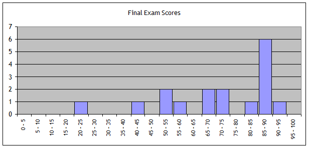
This histogram
shows a great deal of information; more than just a single number could
tell. (Although this histogram, with so
many one- or two-step sizes, could be made much better.)
Often a histogram
is presented, as above, with blocks but it can just as easily be connected
lines, like this:
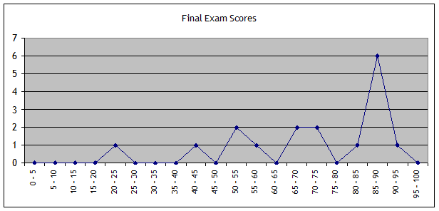
The information in
the two charts is identical.
Histograms are a
good way of showing how the data vary around the middle. This information about the spread of outcomes
around the center is very important to most human decisions – we usually don't
like risk.
Note that the
choice of horizontal scaling or the number of bins can be fraught.
For example
consider a histogram of a student's grades.
If we leave in the A- and B+ grades, we would show a histogram like
this:
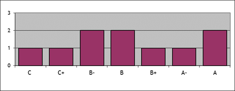
whereas by
collapsing together the grades into A, B, and C categories we would get
something more intelligible, like this:
 .
.
This shows the
central tendency much better – the student has gotten many B grades and
slightly more A grades than C grades.
The previous histogram had too many categories so it was difficult to
see a pattern.
Basic
Concepts: Find the Center of the Data
You need to know
how to calculate an average (mean), median, and mode. After that, we will move on to how to
calculate measures of the spread of data around the middle, its variation.
Average
There are a few
basic calculations that we start with.
You need to be able to calculate an average, sometimes called the mean.
The average of some
values, X, when there are N of them, is the sum of each of the values (index
them by i) divided by N, so the average of X, sometimes denoted ![]() , is
, is
![]() .
.
The average value
of a sample is NOT NECESSARILY REPRESENTATIVE of what actually happens. There are many jokes about the average
statistician who has 2.3 kids. If there
are 100 employees at a company, one of whom gets a $100,000 bonus, then the
average bonus was $1000 – but 99 out of 100 employees didn't get anything.
A common graphical
interpretation of an average value is to interpret the values as lengths along
which weights are hung on a see-saw. The
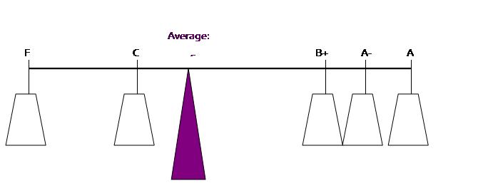
average value is where a fulcrum would just balance the weights. Suppose a student is calculating her
GPA. She has an A (worth 4.0), an A- (3.67),
a B+ (3.33), a C (2.0) and one F (0) [she's having troubles!]. We could picture these as weights:
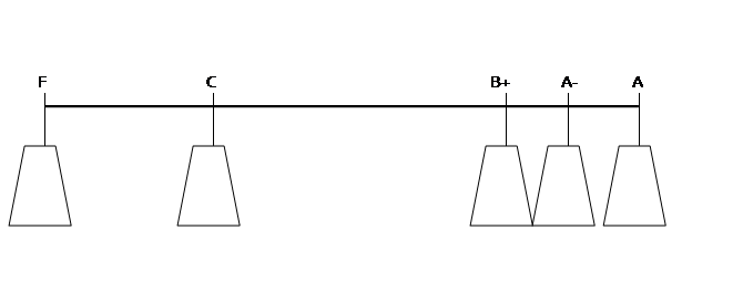
The weights
"balance" at the average point (where (0 + 2 + 3.33 + 3.67 + 4)/5 =
2.6):
So the
"bonus" example would look like this, with one person getting
$100,000 while the other 99 get nothing:
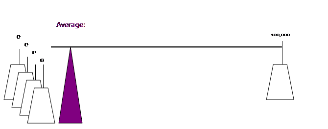
Where there are
actually 99 weights at "zero."
But even one person with such a long moment arm can still shift the
center of gravity away.
Bottom Line: The average is often a good way of understanding what
happens to people within some group. But
it is not always a good way.
Sometimes we
calculate a weighted average using some set of weights, w, so
![]() , where
, where ![]() .
.
Your GPA, for
example, weights the grades by the credits in the course. Suppose you get a B grade (a 3.0 grade) in a
4-credit course and an A- grade (a 3.67 grade) in a 3-credit course; you'd
calculate GPA by multiplying the grade times the credit, summing this, then
dividing by the total credits:
![]() .
.
So in this example
the weights are ![]() .
.
When an average is
projected forward it is sometimes called the "Expected Value" where
it is the average value of the predictions (where outcomes with a greater
likelihood get greater weight). This
nomenclature causes even more problems since, again, the "Expected
Value" is NOT NECESSARILY REPRESENTATIVE of what actually happens.
To simplify some
models of Climate Change, if there is a 10% chance of a 10° increase in
temperature and a 90% chance of no change, then the calculated Expected Value
is a 1° change – but, again, this value does not actually occur in any of the
model forecasts.
For those of you who have taken
calculus, you might find these formulas reminiscent of integrals – good for
you! But we won't cover that now. But if you think of the integral as being
just an extreme form o f a summation, then the formula has the same format.
Median
The median is
another measure of what happens to a 'typical' person in a group; like the mean
it has its limitations. The median is
the value that occurs in the 50th percentile, to the person (or
occurrence) exactly in the middle. If
there are an odd number of outcomes, otherwise it is between the two middle
ones.
In the bonus
example above, where one person out of 100 gets a $100,000 bonus, the median
bonus is $0. The two statistics
combined, that the average is $1000 but the median is zero, can provide a
better understanding of what is happening.
(Of course, in this very simple case, it is easiest to just say that one
person got a big bonus and everyone else got nothing. But there may be other cases that aren't
quite so extreme but still are skewed.)
Mode
The mode is the
most common outcome; often there may be more than one. If there were a slightly more complicated
payroll case, where 49 of the employees got zero bonus, 47 got $1000, and four
got $13,250 each, the mean is the same at $1,000, the median is now equal to
the mean [review those calculations for yourself!], but the mode is zero. So that gives us additional information
beyond the mean or median.
Spread
around the center
Data distributions
differ not only in the location of their center but also in how much spread or
variation there is around that center point.
For example a new drug might promise an average of 25% better results than
its competitor, but does this mean that 25% of patients improved by 100%, or
does this mean that everybody got 25% better?
It's not clear from just the central tendency. But if you're the one who's sick, you want to
know.
This is a familiar
concept in economics where we commonly assume that investors make a tradeoff
between risk and return. Two hedge funds
might both have a record of 10% returns, but a record of 9.5%, 10%, and 10.5%
is very different from a record of 0%, 10%, and 20%. (Actually a record of always winning, no
matter what, distinguished Bernie Madoff's fund...)
You might think to
just take the average difference of how far observations are from the average,
but this won't work.
There's an old joke
about the tenant who complains to the super that in winter his apartment is 50°
and in summer is 90° -- and the super responds, "Why are you
complaining? The apartment is a
comfortable 70° on average!" (So the tenant replies "I'm complaining because I have a squared
error loss function!" If you thought that was funny, you're
a stats geek already!)
The average
deviation from the average is always zero.
Write out the formulas to see.
The average of some
N values, ![]() , is given by
, is given by ![]() .
.
So what is the
average deviation from the average, ![]() ?
?
We know that ![]() and, since
and, since ![]() is the same for every observation,
is the same for every observation, ![]() , if we substitute back from the definition of
, if we substitute back from the definition of ![]() . So
. So ![]() . We can't re-use the
average. So we want to find some useful,
sensible function [or functions],
. We can't re-use the
average. So we want to find some useful,
sensible function [or functions], ![]() , such that
, such that ![]() .
.
Standard Deviation
The most commonly
reported measure of spread around the center is the standard deviation. This looks complicated since it squares the
deviations and then takes the square root, but is actually quite generally
useful.
The formula for the
standard deviation is a bit more complicated:
 .
.
Before you start to
panic, let's go through it slowly. First
we want to see how far each observation is from the mean,
![]() .
.
If we were to just
sum up these terms, we'd get nothing – the positive errors and negative errors
would cancel out.
So we square the deviations
and get
![]() ,
,
and then just
divide by n to find the average squared error, which is known as the variance,
which is
![]() .
.
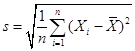
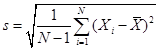
The standard
deviation is the square root of the variance; ![]()
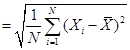 .
.
Of course you're
asking why we bother to square all of the parts inside the summation, if we're
only going to take the square root afterwards.
It's worthwhile to understand the rationale since similar questions will
re-occur. The point of the squared
errors is that they don't cancel out.
The variance can be thought of as the average size of the squared
distances from the mean. Then the square
root makes this into sensible units.
The variance and
standard deviation of the population divides by N; the variance and standard
deviation of a sample divide by (N – 1).
This is referred to as a "degrees of freedom correction,"
referring to the fact that a sample, after calculating the mean, has lost one
"degree of freedom," so the standard deviation has only (N – df)
remaining. You could worry about that
difference or you could note that, for most datasets with huge N (like the ATUS
with almost 100,000), the difference is too tiny to worry about.
Our notation
generally uses Greek letters to denote population values and English letters
for sample values, so we have
![]() and
and
 .
.
As you learn more statistics
you will see that the standard deviation appears quite often. Hopefully you will begin to get used to it.
We could look at
other functions of the distance of the data from the central measure, ![]() , such that
, such that ![]() -- for example, the
mean of the absolute value,
-- for example, the
mean of the absolute value, ![]() . By recalling the
graphs of these two functions you can begin to appreciate how they differ:
. By recalling the
graphs of these two functions you can begin to appreciate how they differ:
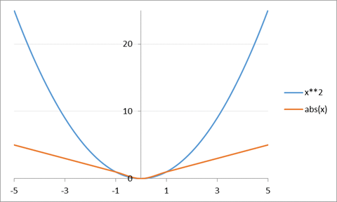
So that squaring
the difference counts large deviations very much worse than small deviations,
whereas an absolute deviation does not.
So if you're trying to hit a central target, it might well make sense
that wider and wider misses should be penalized worse, while tiny misses should
be hardly counted.
There is a relationship
between the distance measure selected and the central parameter. For example, suppose I want to find some
number, Z, that minimizes a measure of distance of this number, Z, from each
observations. So I want to minimize ![]() . If we were to use
the absolute value function then setting Z to the median would minimize the
distance. If we use instead the squared
function then setting Z to the average would minimize the distance. So there is an important connection between
the average and the standard deviation, just as there is a connection between
the median and the absolute deviation. (Can you think of what distance measure is connected with the mode?)
. If we were to use
the absolute value function then setting Z to the median would minimize the
distance. If we use instead the squared
function then setting Z to the average would minimize the distance. So there is an important connection between
the average and the standard deviation, just as there is a connection between
the median and the absolute deviation. (Can you think of what distance measure is connected with the mode?)
If you know
calculus, you will understand why, in the age before computer calculations,
statisticians preferred the squared difference to the absolute value of the
difference. If we look for an estimator
that will minimize that distance, then in general in order to minimize
something we will take its derivative.
But the derivative of the absolute value is undefined at zero, while the
squared distance has a well-defined derivative.
Sometimes you will
see other measures of variation; the textbook goes through these
comprehensively. Note that the
Coefficient of Variation, ![]() , is the reciprocal of the signal-to-noise ratio. This is an important measure when there is no
natural or physical measure, for example a Likert scale. If you ask people to rate beers on a scale of
1-10 and find that consumers prefer Stone's Ruination Ale to Budweiser by 2
points, you have no idea whether 2 is a big or a small difference – unless you
know how much variation there was in the data (i.e. the standard
deviation). On the other hand, if
Ruination costs $2 more than Bud, you can interpret that even without a
standard deviation.
, is the reciprocal of the signal-to-noise ratio. This is an important measure when there is no
natural or physical measure, for example a Likert scale. If you ask people to rate beers on a scale of
1-10 and find that consumers prefer Stone's Ruination Ale to Budweiser by 2
points, you have no idea whether 2 is a big or a small difference – unless you
know how much variation there was in the data (i.e. the standard
deviation). On the other hand, if
Ruination costs $2 more than Bud, you can interpret that even without a
standard deviation.
In finance, this
signal/noise ratio is referred to as the Sharpe Ratio, ![]() , where
, where ![]() are the average
returns on a portfolio and
are the average
returns on a portfolio and ![]() is the risk-free rate;
the Sharpe Ratio tells the returns relative to risk.
is the risk-free rate;
the Sharpe Ratio tells the returns relative to risk.
Sometimes we will
use "Standardized Data," usually denoted as ![]() , where the mean is subtracted and then we divide by the
standard deviation, so
, where the mean is subtracted and then we divide by the
standard deviation, so ![]() . This is
interpretable as measuring how many standard deviations from the mean is any
particular observation. This allows us
to abstract from the particular units of the data (meters or feet; Celsius or
Fahrenheit; whatever) and just think of them as generic numbers.
. This is
interpretable as measuring how many standard deviations from the mean is any
particular observation. This allows us
to abstract from the particular units of the data (meters or feet; Celsius or
Fahrenheit; whatever) and just think of them as generic numbers.
Now Do
It!
We'll use data from
the Census PUMS, on just people in New York City, to begin actually doing
statistics using the analysis program called SPSS. There are further lecture notes on each of
those topics. Read those carefully;
you'll need them to do the homework assignment.
Overview
of PUMS
We will use data
from the Census Bureau's "Public
Use Microdata Survey," or PUMS.
This is collected in the American Community Survey; just about every ten
years since 1790 the Census has made a complete enumeration of the US
population as required by the Constitution.
We will work on
this data using SPSS. Later I give an
overview of the basics of how to use that program (there are also videos
online).
The dataset, which
is only just information on respondents in the five boroughs of New York City,
is ready to use in SPSS. Download it
from the class web page (or InYourClass page) onto your computer desktop. It is zipped so you must unzip it. Remember that if you're in the computer lab,
just double-clicking on the SPSS file may not automatically start up SPSS;
you'll get some error code. So use the
Start bar to find SPSS and start the program that way. Then open up your dataset once the program
has loaded.
SPSS has two views
of the dataset: Variable View and Data View.
Usually we use the Variable View; this lists all of the different
information available.
The dataset has
information on 315,771 people in 133,043 households. If there is a family living together in an apartment,
say a mother and two kids, then each person has a row of data telling about
him/her (age, gender, education, etc) but only the head of household (in this
case, the mother) would have information about the household (how much is spent
on rent, utilities, etc.). Depending on
what analysis is to be made, the researcher might want to look at all the
people or all of the households (or subsets of either). If you look at the "Data View" tab
you can see the difference. (Note that
the "head of household" is defined by the person interviewed so it
could be the man or woman, if there are both.)
The first column of
data is a serial number, shared by each person in the household. After that you can see that some variables
are filled in for every person (age, female, education levels) but other
variables are only filled in for one person in the household (has_kids,
kids_under6, kids_under17).
Many of the
variables are coded as "dummy variables" which simply means that they
have a value of zero or one – a one codes as "yes, true" and a zero
is "no, false." So one of the
first dummy variables is named "female" and women have a 1 while men
have a 0. (According to the government,
everybody must be one or the other.)
There are variables
coding people's race/ethnicity, if they were born in the US or a foreign
country, how much schooling they have, if they are single or married, if
they're a veteran (and when they served), even what borough they live in and
how they commute to work. There is some
greater detail about ancestry (where people can write in detail about their
background). There is information about
their incomes. For the household there
is information about the dwelling including when built, number of various
rooms, how recently they moved, amount paid for fuel, mortgage/rent and
fraction of monthly household income that is spent on mortgage/rent, etc.
Basics
of government race/ethnicity classification
The US government
asks questions about people's race and ethnicity. These categories are social constructs, which
is a fancy way of pointing out that they are not based on hard science but on
people's own views of themselves (influenced by how people think that other
people think of them...). Currently the
standard classification asks people separately about their "race" and
"ethnicity" where people can pick labels from each category in any
combination.
The
"race" categories that are listed on the government's form are: "White alone," "Black or African-American alone," "American Indian alone," "Alaska
Native alone," "American Indian and Alaska Native tribes specified;
or American Indian or Alaska native, not specified and no other
race," "Asian alone," "Native Hawaiian and other Pacific
Islander alone," "Some other
race alone," or "Two or more
major race groups." (Then the
supplemental race categories offer more detail.)
These are a
peculiar combination of very general (well over 40% of the world's population
is "Asian") and very specific ("Alaska Native alone")
representing a peculiar history of popular attitudes in the US. Only in the 2000 Census did they start to
classify people in mixed races. If you
were to go back to historical US Censuses from more than a century ago, you
would find that the category "race" included separate entries for
Irish and French and various other nationalities. Stephen J Gould has a fascinating book, The Mismeasure of Man, discussing how
early scientific classifications of humans tried to "prove" which
nationalities/races/groups were the smartest.
Note that "Hispanic"
is not "race" but rather ethnicity (includes various other labels
such as Spanish, Latino, etc.). So a
respondent could choose "Hispanic" and any race category – some
choose "White," some choose "Black," some might be combined
with any other of those complicated racial categories.
What that means,
specifically for us reporting statistics on a dataset like this, is that we can
easily find that, of the 315,771 people in the PUMS dataset who live in the
five boroughs of New York City, 48.2%
report their race as "White alone" and 24.2% as "Black
alone," 12.3% report as "Asian alone," 12.7% report "some
other race alone," 2.2% report multiple races, and less than 1% report any
Native American category. Then 24.1%
classify their ethnicity as Hispanic.
Can we just take the 48.2% White, subtract the 24.1% Hispanic to say
that 24.1% are "non-Hispanic White" (a category commonly used in
other government classifications)?
NO! Because that assumes that all
of the people who self-classified as Hispanic were also self-classified as
"White only" which is not true.
We would have to create a new variable for non-Hispanic White to find
that proportion. (Below I'll explain how
to do this with SPSS.)
The Census Bureau
gives more information here, http://www.census.gov/newsroom/minority_links/minority_links.html
All of these racial
categories makes some people uneasy: is the government encouraging racism by
recognizing these classifications? Some
other governments choose not to collect race data. But that doesn't mean that there are no
differences, only that the government doesn't choose to measure any of these
differences. In the US, government
agencies such as the Census and BLS don't generally collect data on religion
(except, for historical reasons, Judaism, sometimes considered a race or
ethnicity – none of this makes any logical sense!).
About
SPSS
SPSS is a popular
and widely-used statistical program. It
is powerful but not too overwhelming for a beginner. SPSS is a bit harder than Excel but gives you
a much wider menu of statistical analysis.
You don't have to write computer programs like some of the others – you
can just use drop-down menus and point and click.
Why learn this
particular program? You should not be
monolingual in statistical analysis, it is always useful to learn more
programs. The simplest is Excel, which
is very widely used but has a number of limitations – mainly that, in order to
make it easy for ordinary people to use, they made it tough for power
users. SPSS is the next step: more
powerful but also a bit more difficult.
Next is Stata and SAS, which are a bit more powerful but also tougher to
use. Matlab is great but requires
writing programs of computer code. R is
an open-source version (we'll use that a little for this class) that is used by
many researchers but it requires some work to learn. Python is necessary if you're going to become
a real data analyst. The college has
SPSS, SAS, and Matlab freely available in all of the computer labs.
You might be
tempted to just use Excel; resist! Excel
doesn't do many of the more complex statistical analyses that we'll be learning
later in the course. Make the investment
to learn a better program; it has a very good cost/benefit ratio.
The
Absolute Beginning
Start up SPSS. On any of the computers in the Economics lab
(6/150) double-click on the "SPSS" logo on the desktop to start up
the program. In other computer labs you
might have to do a bit more hunting to find SPSS (if there's no link on the
desktop, then click the "Start" button in the lower left-hand corner,
and look at the list of "Programs" to find SPSS).
Sometimes double-clicking on a file that
is associated with SPSS doesn't
work! Especially if it's zipped. Same if you try to download a file and
automatically start up SPSS. So start
SPSS from the Start bar or desktop icon.
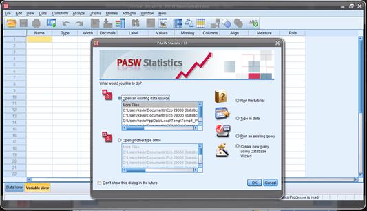
SPSS usually brings
up a screen like the one below asking "What
would you like to do?"
which offers some shortcuts. Just
"Cancel" this screen if it appears (later, as you get more familiar
with the program, you might find those shortcuts more useful).
Load a
SPSS Dataset
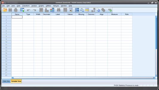
When SPSS starts,
you will be in the "SPSS Data
Editor" which looks like this.
![]()
Click on "File" then choose "Open"
then "Data…"
[not "File/Open Database"
– that's different].
To open the ATUS
data, download it from the class webpage onto your computer desktop. Start SPSS.
Then "File \ Open \ Data..."
and find "ATUS_2003-09.sav".
(Many datasets are zipped, you first unzip it, then load it.)
SPSS has two tabs
(at the bottom left, in the yellow circle above) to change the way you view
your data. The "Data View" tab
shows the data the way it would look if it were on an Excel sheet. The "Variable View" tab shows more
information on the particular variable – most importantly, the "name",
"label",
and "values". The Name
is how SPSS refers to the variable in its menus – these names tend to be
inscrutable but you can think of them as nicknames. The Label
gives more details, so use the mouse to expand that column so that you can read
more. Then values tells you useful information about how the variable is
coded.
Save
your Work!
After you've made
changes, you don't want to lose them and have to re-do them. So save your dataset! ("File"
then "Save") You might want to give it a new name every so
often, so that you can easily revert back to an old version if you really screw
up on some day.
The computers in
the lab wipe the memory clean when you log off so back up your data. Either online (email it to yourself or upload
to Google Drive or iCloud or Blackboard) or use a USB drive. Also, figure out how to "zip" your
files (right-click on the data file) to save yourself some hours of up/download
time…
Getting
Basic Statistics
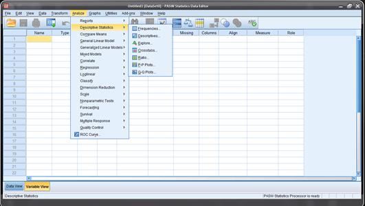
From either the
"Data View" or "Variable View" tab, click "Analyze"
then "Descriptive
Statistics" then "Descriptives":
This will bring up
a dialog box asking you which variables you want to get Descriptive Statistics
on.
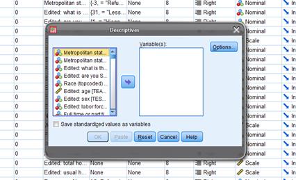
Click on the
variable you want. Then click the arrow
button in the center box, which will move the variables into the column labeled
"Variable(s)". If you make a mistake and move the wrong
variable, just highlight it in the "Variable(s)" column and use
the arrow to move it back to the left.
Then click "OK"
and let the computer work.
If you want a bunch
that are all together in the list, click on the first variable that you want,
then hold down the "Shift" key and click on the last variable --
this highlights them all. If you want a
bunch that are separated, hold down the "Ctrl"
key and click on the ones you want.
Later, once you're
feeling confident, click on "Options" to see what's there.
Create
New Variables, like Age-squared or Interaction Age*Dummy, or take logs or
whatever
We often create new
variables. One common transformation is
taking the log. This is a common
procedure to cut down the noise and help to examine growth trends. Click on "Transform" and then "Compute…". This will bring up a dialog box labeled
"Compute Variable".
Type in the new
variable name (whatever you want, just remember it!) under "Target Variable". (You can click
'Type & Label" if you
want to enter more info that can remind yourself later.) For example we'll find the log (natural log)
of weekly earnings.
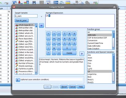
Under "Target Variable" type in the new name,
"ln_earn" or whatever and then in "Numeric Expression" you tell it what
this new variable is. You can make any
complicated or convoluted functions that are necessary for particular analyses;
for now find the "Function Group"
to click on "Arithmetic" and
then in the "Functions and Special
Variables" list below find "Ln". Double-click it and see that SPSS puts it up
into the "Numeric Expression"
box with a (?) in the argument. Double-click on the variable, weekly earnings
(TRERNWA), that you want to use
and then hit "OK".
You'll get a bunch
of errors where the program complains about trying to find the log of zero, but
it still does what you need. For wages,
where many people have wage=0, we often use lnwage = ln(wage + 1) which
eliminates the problem of ln(0) that returns an error; for most other people
the distinction between ln(1000) and ln(1001) is tiny. You can go back and re-do your variable if
you're feeling a need to be tidy.
We often recode
using logical (Boolean) algebra, so for example to make a variable
"Hispanic" you'd type "Hispanic"
into the Target Variable, then click the "(
)" button (see the yellow circle in the screenshot below) to get a
parenthesis, double-click the variable that codes ethnicity so as to get PEHSPNON in the "Numeric Expression" and then add
"=1" to finish, so
getting a relationship that Hispanic is defined as: (PEHSPNON = 1).
SPSS understands that whenever that relation is true, it will put in a
1; where false it will put in a 0.

There are other
logical buttons (also in the yellow circle above) for putting together various
logical statements. The line up and
down, |, represents the logical
"OR"; the tilde, ~, is
logical "NOT".
If you wanted to
create a variable for those who report themselves as African-American and
Hispanic, you'd create the expression (AfricanAmerican
= 1) & (Hispanic = 1).
If we want more
combinations of variables then we create those.
Usually a statistical analysis spends a lot of time doing this sort of
housekeeping – dull but necessary.
Re-Coding
complicated variables (like race, education, etc) from initial data
Often we have more
complicated variables so we need to be careful in considering the "Values" labels. For instance in the ATUS, as you look at the
"Variable View" of
your dataset, one of the first variables in the dataset has the name "PEEDUCA", which is short for
"PErson EDUCation Achieved" – the person's education level. But the coding is strange: under "Values" you should see a box with
"…" in it – click on
that to see the whole list of values and what they mean. You'll see that a "39" means that the person
graduated high school; a "43"
means that they have a Bachelor's degree.
Without that "Values"
information you'd have no way to know that.
It also means that you must do a bit of work re-coding variables before
you work with the data. The variable
"TEAGE" (which is the
person's age) has numbers like 35, 48, 19 – just what you'd expect. These values have a natural interpretation;
you don't need a codebook for this one!
The variable "TESEX"
tells whether the person is male or female – but it doesn't use text, it just
lists either the number 1 or 2. We could
guess that one of those is male and the other female, but we'd have to go back
to "Variable View" to
look at "Values" for
"TESEX" to find that a
1 indicates a male and a 2 indicates female.
Start with "TESEX" to create, instead, a
dummy variable (that takes a value of just zero or one) called "female" that is equal to one if
the person is female and zero if not. To
do this, click "Transform"
then "Compute…" which
will bring up a dialog box. The "Target Variable" is the new variable
you are creating; for this case, type in "female". The "Numeric
Expression" allows considerable freedom in transforming
variables. For this case, we will only
need a logical expression: "TESEX
= 2". You can either type in
the variable name, "TESEX",
or find the variable name in the list on the left of the dialog box and click
the arrow to insert the name.
Later you might
encounter cases where you want more complicated dummy variables and want to use
logical relations "and" "or" "not" (the symbols
"&", "|", "~") or the ">="
or multiplication or division. But in
this case, we just need "TESEX = 2"
which SPSS interprets as telling it to set a value of 1 in each case where that
logical expression is true, and a value of zero in each case where that
expression is false. If you go to "Data View" and scroll over (new
variables are all the way on the right) you can check that it looks right.
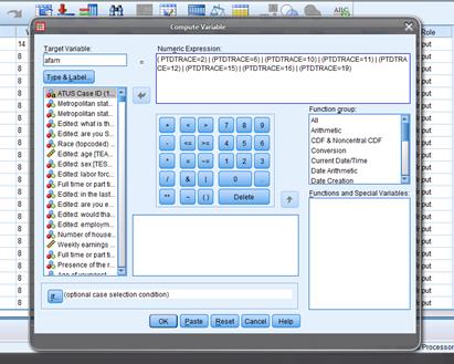
Next we'll create
the racial variables. We'll create dummy
variables for "white", "African-American", "American
Indian/Inuit/Hawaiian/Pacific Islander", and "Asian." We'll lump together the people who give
multiple identities with those who give a single one (this is standard in much
empirical work, although it is evolving rapidly).
So "Tranform/Compute…" and label
"Target
Variable" as "white" with "Numeric
Expression" "PTDTRACE=1". Then "afam" is "( PTDTRACE=2)
| (PTDTRACE=6) | (PTDTRACE=10) | (PTDTRACE=11) | (PTDTRACE=12) | (PTDTRACE=15)
| (PTDTRACE=16) | (PTDTRACE=19)" – note the parentheses and the
"or" symbol. "Asian"
is "(
PTDTRACE=4) | (PTDTRACE=8)".
"Amindian"
is "(
PTDTRACE=3) | (PTDTRACE=5) | (PTDTRACE=7) | (PTDTRACE=9) | (PTDTRACE=13) | (PTDTRACE=14)
| (PTDTRACE=17) | (PTDTRACE=18) | (PTDTRACE=20) | (PTDTRACE=21)". Many of these codings of multiple races could
be argued – you can make changes if you wish. One reason to learn to do this
yourself is to find out where minor changes could make a difference in the
conclusions. Do you think that, say,
average wages are different for these racial categories?
We create a dummy
variable for "Hispanic". Again
use "Transform/Compute…"
and label "Target Variable" as "Hispanic"
with "Numeric
Expression" of "(PEHSPNON
= 1)".
Earlier I mentioned
that we can't find non-Hispanic whites by taking the total number of
"white only" and subtracting "Hispanic" but how can we find
the actual number of non-Hispanic whites?
On the drop-down menu of SPSS find "Transform" then
"Compute Variable" then in the dialog box, give the new variable (it
calls it the "Target Variable") a name (e.g.
"nonHispWhite") and a Numeric Expression, for example here " (RAC1P
= 1) & (HISP = 1) ". The first
expression evaluates, for each case, whether the variable, "RAC1P"
which is the variable coding race, has a value of 1 (which corresponds to the
label "White alone"). If it
equals 1 then the expression is True, which is coded as 1; if RAC1P does not
equal 1 then the expression is False, coded as zero. The second expression evaluates if
"HISP" equals 1 or not. The
"&" sign in the middle evaluates if both expressions are true or
not. When we run this classification, we
find that 38.9% are non-Hispanic white, a big difference from the previous 24%!
Create dummy
variables for education: a dummy for no high school "ed_nohs", for high school but no
further "ed_hs",
for some college "ed_scol", for a bachelor's degree "ed_coll",
and for more than a 4-year degree "ed_adv". "Transform/Compute…", set
"Target
Variable" as "ed_nohs" and "Numeric
Expression" as " PEEDUCA
<39". Then "ed_hs"
is " PEEDUCA =39";
"ed_scol"
is "( PEEDUCA >39)&( PEEDUCA <43)"; "ed_coll"
is " PEEDUCA =43";
"ed_adv"
is " PEEDUCA
>43". Sometimes we
distinguish various sorts of "some college" between people who got an
Associate's degree versus those who took classes but never got any degree.
Then run
"Descriptive Statistics" to make sure everything looks right – your
dummy variables should have min=0 and max=1, for example!
Data
Sub-Sets
Often we want to
compare groups of people within the dataset to each other, for example looking
at whether men or women get paid more or commute different or whatever. Comparisons are often more useful than just
raw numbers because comparisons allow us to begin to judge which differences
are substantial.
Do this with "Data" then "Select Cases..." to get a screen
like this:
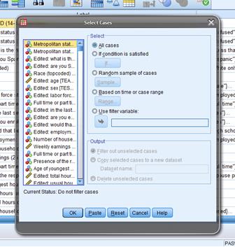
Usually we select
cases "If condition is satisfied"
so choose that, then click on "If..."
This brings up a
dialog box that looks like the "Compute Variable" box from
above. If we have already created a
dummy variable that has values of only zeroes and ones then you can just put
that into the "Select Cases" box.
If you want a more complicated set then you can build it up using the
logical notation that we discussed above.
So suppose you want to look at just the subgroup of women between the
ages of 18-35. Then we would enter
"(TESEX = 2) & (TEAGE > 18)
& (TEAGE <= 35)".
Click "Continue". Make
sure the output is "Filter out unselected cases" (you don't usually
want to permanently delete the unselected cases!). Then all of your subsequent analyses will be
done for just that subgroup.
Often an analysis
will be more concerned with whether a particular item is done rather than how
long – for example, when looking at working, whether a person has a second job
(so time spent working second job is greater than zero) is probably more
important than just how long they spent working at this second job. So often the "if..." statement will be of the form, "X > 0" for whatever variable,
X, you're considering.
Later on, we will
learn some more sophisticated ways of doing it but for now this is
straightforward and clear. It will allow
you to do the homework assignment.
Example
I will do an
example to make this a bit clearer. We
will look at the difference in how much time male and female college students
spend watching TV. (I hope that for you
the answer, how much time is wasted on TV, is "zero"!)
Open the ATUS
2003-2009 dataset.
First use "Transform \ Compute ..." to
create a new variable, tv_time, which we set equal to the sum of T120303,
watching non-religious TV, and T120304, watching religious TV. (Should we include T120308, playing computer
games?)
Use "Transform
\ Compute ..." to create another variable, educ_time, which is the
sum of time spent doing things relevant to education, T060101 + T060102 +
T060103 + T060104 + T060199 + T060301 + T060302 + T060303 + T060399. (Time spent in class and time spent doing
homework, mainly.)
I'll also create
"ratio_TV_study" that is the ratio of TV_time to educ_time.
Run "Analyze \ Descriptive Statistics \
Descriptives ..." to check that these seem sensible:
|
Descriptive Statistics |
|||||
|
|
N |
Minimum |
Maximum |
Mean |
Std. Deviation |
|
tv_time |
98778 |
.00 |
1417.00 |
165.2058 |
168.33963 |
|
educ_time |
98778 |
.00 |
1090.00 |
16.3008 |
79.47292 |
|
ratio_TV_study |
5974 |
.00 |
120.00 |
1.0450 |
3.00829 |
|
Valid
N (listwise) |
5974 |
|
|
|
|
Note that the
average for "educ_time" is low because most non-students will report
zero time spent studying. All of those
zero values returned errors when computing the ratio, so this has only 5974 reports
of people with more than zero time studying.
Use "Data \
Select Cases ... " to select only college students (those for whom the 13th
variable, TESCHLVL, is equal to 2).
Now to compare men
and women I will use "Data \ Split
File ... " to split into two groups and compare them – the program
will do this automatically for all subsequent analysis.
This Split File
screen is:
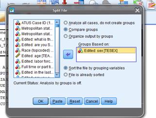
Now when I run the
same "Descriptives" as before, this time I get the output subdivided:
|
Descriptive
Statistics |
||||||
|
Edited: sex |
N |
Minimum |
Maximum |
Mean |
Std.
Deviation |
|
|
= "Male" |
tv_time |
2018 |
.00 |
860.00 |
127.1665 |
138.93259 |
|
educ_time |
2018 |
.00 |
1051.00 |
112.6056 |
186.01012 |
|
|
ratio_TV_study |
784 |
.00 |
75.00 |
.8390 |
3.02939 |
|
|
Valid N (listwise) |
784 |
|
|
|
|
|
|
=
"Female" |
tv_time |
3581 |
.00 |
1100.00 |
111.4739 |
124.86338 |
|
educ_time |
3581 |
.00 |
1090.00 |
104.8176 |
173.84758 |
|
|
ratio_TV_study |
1450 |
.00 |
120.00 |
.9117 |
4.04470 |
|
|
Valid N (listwise) |
1450 |
|
|
|
|
|
This shows that
male college students watch an average of 127 minutes of TV per day and devote
an average of 113 minutes to school; females watch 111 minutes of TV and devote
105 minutes to their studies. Men watch
more TV but also spend a bit more time on school so the average ratio of time
spent watching TV to time spent on school is .91 for women and .84 for men.
Finally I'll show a
graph,
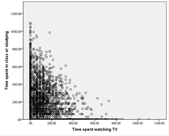
Note that there are
quite a number of respondents who spent zero time studying or zero time
watching TV. We would expect a downward
relation since it is like a budget set: the more time is spent watching TV, the
less is available to do anything else.
To get this graph,
choose "Graphs \ Chart Builder ..."
and drag the elements to where you want them, like this,
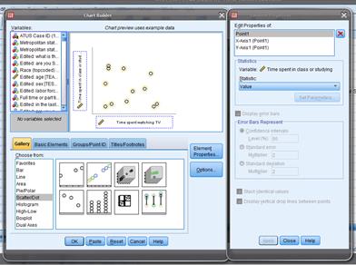
This is the first
type of "Scatter/Dot" graph.
For this graph I
removed the split, since it didn't look like there were significant differences
between men and women in that regard – the same "Data \ Split File ... " but now "Analyze all
cases."
I can create a
histogram of the ratio of time spent watching TV to time spent studying, 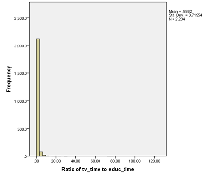
But this isn't much
use since it's dominated by the few extreme values of people who spent 100 or
more times as many minutes in TV as studying.
So this histogram,
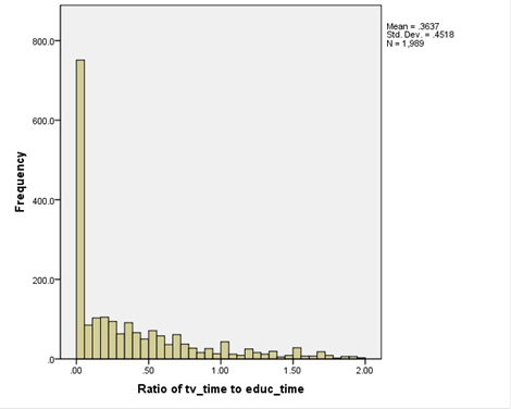
plots only those
with a ratio less than 2.
(To make this
chart, I used "Graphs \ Chart
Builder ..." and then chose "Bar." When you put in just one variable on the
x-axis it assumes you want a Histogram.)
Now you can go on
to do your own analysis, maybe by race/ethnicity? Or go back and add in video game
playing? Of the people who didn't watch
TV, were there a larger fraction of men or women?
Some
Shortcuts
You can use "Analyze \ Descriptive Statistics \ Explore..." which
asks you to put in the "Dependent
List" which are the variables, whose means you want to find, and
then the "Factor List"
which defines categories, by which the subgroup means are found. So, for example, if you wanted to look at the
time sleeping, depending on whether there are kids in the house, you could put
"Time Sleeping" into
the "Dependent List"
and then "Presence of Household
Children" into the "Factor
List".
You can get fancier if you create your own
factors – suppose you wanted to look at time sleeping for African-American,
Hispanic, Asian, and whites at 5 levels of education each (without highschool
diploma, with just diploma, with some college, with 4-year degree, with
advanced degree) – for a total of 4 x 5 = 20 different categories. So create a new variable that takes the
values 1 through 20 and carefully code it up for each of those categories. Then put that into "Factor" in
"Explore" and let the machine do your work.
SPSS also has
"Analyze \ Compare Means" but we won't get to that yet (although
you're welcome to explore it on your own!).
Other
Datasets
The class will use
a number of other data sets, which I have provided to you already formatted for
SPSS. These are usually assembled by
government bureaucrats who love their acronyms so they include names like Fed
SCF, NHIS, BRFSS, NHANES, WVS, historical PUMS.
Overview of ATUS data
We will also use data from the
"American Time Use Survey," or ATUS.
This asks respondents to carefully list how they spent each hour of
their time during the day; it's a tremendous resource. The survey data is collected by the US Bureau
of Labor Statistics (BLS), a US government agency. You can find more information about it here, http://www.bls.gov/tus/.
The dataset has information on 112,038
people interviewed from 2003-2010. This
gives you a ton of information – we
really need to work to get even the simplest information from it.
The dataset is ready to use in SPSS. Download it from the class page onto your
computer. If it is zipped, then unzip
it. Remember that if you're in the
computer lab, just double-clicking on the SPSS file may not automatically start
up SPSS; you'll get some error code. So
use the Start bar to find SPSS and start it that way. Then open up your dataset once the program
has loaded.
The ATUS has data telling how many minutes
each person spent on various activities during the day. These are created from detailed logbooks that
each person kept, recording their activities throughout the day.
They recorded how much time was spent with
family members, with spouse, sleeping, watching TV, doing household chores,
working, commuting, going to church/religious ceremonies, volunteering – there
are hundreds of specific data items!
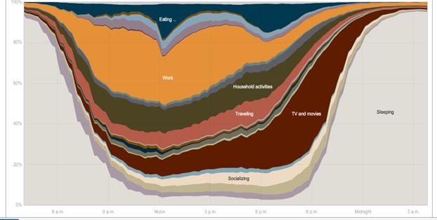
The NY Times had this graphic showing the
different uses of time during the day [here http://www.nytimes.com/interactive/2009/07/31/business/20080801-metrics-graphic.html is the full interactive chart where you can
compare the time use patterns of men and women, employed and unemployed, and
other groups – a great way to lose an evening! The article is
here http://www.nytimes.com/2009/08/02/business/02metrics.html?_r=2 ]
To use the data effectively, it is helpful
to understand the ATUS classification system, where additional numbers at the
right indicated additional specificity.
The first two digits give generic broad categories. The general classification T05 refers to time spent doing things
related to work. T0501 is specific to actual work; T050101 is "Work, main job" then T050102 is "Work, other job," T050103 is "Security Procedures related to work," and T050189 is "Working, Not Elsewhere
Classified," abbreviated as n.e.c. (usually if the final digit is a nine
then that means that it is a miscellaneous or catch-all category). Then there are activities that are strongly
related to work, that a person might not do if they were not working at a
particular job – like taking a client out to dinner or golfing. These get their own classification codes, T050201, T050202, T050203, T050204, or T050289. The list continues;
there are "Income-generating hobbies, crafts, and food" and "Job
interviewing" and "Job search activities." These have other classifications beginning
with T05 to indicate that they are
work-related.
So for instance, to create a variable,
"Time Spent Working" that we might label "T_work," you
would add up T050101, T050102, T050103, T050189, T050201, T050202, T050203,
T050204, T050289, T050301, T050302, T050303, T050304, T050389, T050403,
T050404, T050405, T050481,
T050499, and T059999. You might
want to add in "Travel related to working" down in T180501. (No sane human would remember all these
codings but you'd look at the "Labels" in SPSS and create a new
variable.) It's tedious but not
difficult in any way.
Some variables are even more detailed –
playing sports is broken down into aerobics, baseball, basketball, biking,
billiards, boating, bowling, ... all the way to wrestling, yoga, and "Not
Elsewhere Classified" for those with really obscure interests. Then there are similar breakdowns for
watching those sports. Most people will
have a zero value for most of these but they're important for a few people.
You can imagine that different researchers,
exploring different questions, could want different aggregates. So the basic data has a very fine
classification which you can add up however you want.
Fed
SCF, Survey of Consumer Finances produced by the Federal Reserve
This survey is only
made once every three years; the most recent data is from 2010. The survey gives a tremendous amount of
information about people's finances: how much they have in bank accounts (and
how many bank accounts), credit cards, mortgages, student loans, auto and other
loans, retirement savings, mutual funds, other assets – the whole panoply of
financial information. But there's a
catch. As you probably know from class
as well as from personal experience, wealth is very unequally distributed. Some people have few financial assets at all,
not even a bank account. Many people
have only a few basic financial instruments: a credit card, some basic loans
and a simple bank account. Then a few
wealthy people have tremendously complicated portfolios of assets.
How does a
statistical survey deal with this? By
unequal sampling then weighting – all of the samples I provide here do this to
one degree or another, but it becomes very important in the Fed SCF. The idea is simple: from the perspective of a
survey about finance, all people with no financial assets look the same – they
have "zero" for most answers in the survey. So a single response is an accurate sample
for lots and lots of people. But people
with lots of financial assets have varied portfolios, so a single response is
an accurate sample for only a small number of people. So if I were tasked with finding out about
the financial system but could only survey 10 people, I might reasonably choose
to sample 8 rich people with complicated portfolios and maybe 1 middle-class
person and 1 poor person. I would keep
in mind that the population of people in the country are not 80% rich, of
course! In somewhat fancier statistics,
I would weight each person, so the poor person would represent tens of millions
of Americans, the middle-class person might represent more than a hundred
million, and the rich people would each only represent a few million. If I wanted to extrapolate from the sample to
the population, I would have to use these weights.
Many of the surveys
we'll be using in class are weighted, and if you want to use them correctly
you'll have to do the weighted versions.
I'm skipping that for this class only because I think the cost outweighs
the benefits for students early in their curriculum.
Actually using the
Fed SCF survey can be difficult because the information is so richly detailed. You might want, say, a family's total debt,
but instead get debt on credit card #1, card #2, all types of different loans,
etc. so you have to add them up yourself.
You have to do a bit of preliminary work.
NHIS
National Health Interview Survey
This dataset has
all sorts of medical and healthcare data – who has insurance, how often they're
sick, doctor visits, pregnancy, weight/height.
In the US many people have health insurance provided through their work
so the economics of health and economics of insurance become tangled together.
BRFSS,
Behavioral Risk Factor Surveillance System Survey
This dataset has
many observations on a wide variety of risky behaviors: smoking, drinking, poor
eating, flu shots, whether household has a 3-day supply of food and
water... There is some economic data
such as a person's income group.
NHANES –
National Health And Nutrition Examination Survey
This has even more
detail but on a smaller sample than the BRFSS.
On whether people have healthy lifestyles: eat veg and fruit, their BMI,
whether they smoke (various things), use drugs, sex (number of partners) – lots
of things that are interesting enough to compensate for the dull (!?!?) stats
necessary to analyze it.
There are other
common data sources that are easily available online, which you can consider as
you reflect upon your final project.
IPUMS
This is a
tremendous data source, that has historical census data for past centuries,
from http://www.ipums.org/. Some of the
historical questions are weird (they asked if a person was "idiotic"
or "dumb" – which sounds crazy but used to be scientific terms). It includes full names and addresses from
long-ago census data.
WVS
World Values Survey
This has a bit less
economics but still lots of interesting survey data about attitudes of people
of many issues; the respondents are global from scores of countries over
several different years. There is some
information about personal income, education and occupation so you can see how
those correlate with, say, attitudes toward democracy, religiosity, or other
hot issues.
Demographic
and Health Surveys from USAID
These give careful
data about people in developing countries, to look at, say, how economic growth
impacts nourishment.
On
Correlations: Finding Relationships between Two Variables
In a case where we
have two variables, X and Y, we want to know how or if they are related, so we
use covariance and correlation.
Suppose we have a
simple case where X has a two-part distribution that depends on another
variable, Y, where Y is what we call a "dummy" variable: it is either
a one or a zero but cannot have any other value. (Dummy variables are often used to encode
answers to simple "Yes/No" questions where a "Yes" is
indicated with a value of one and a "No" corresponds with a
zero. Dummy variables are sometimes
called "binary" or "logical" variables.) X might have a different mean depending on
the value of Y.
There are millions
of examples of different means between two groups. GPA might be considered, with the mean
depending on whether the student is a grad or undergrad. Or income might be the variable studied, which
changes depending on whether a person has a college degree or not. You might object: but there are lots of other
reasons why GPA or income could change, not just those two little reasons – of course! We're not ruling out any further
complications; we're just working through one at a time.
In the PUMS data, X
might be "wage and salary income in past 12 months" and Y would be
male or female. Would you expect that
the mean of X for men is greater or less than the mean of X for women?
Run this on SPSS ...
In a case where X
has two distinct distributions depending on whether the dummy variable, Y, is
zero or one, we might find the sample average for each part, so calculate the
average when Y is equal to one and the average when Y is zero, which we denote ![]() . These are called
conditional means since they give the mean, conditional on some value.
. These are called
conditional means since they give the mean, conditional on some value.
In this case the
value of ![]() is the same as the
average of the two variables multiplied together,
is the same as the
average of the two variables multiplied together, ![]() .
.
![]() .
.
This is because the
value of anything times zero is itself zero, so the term ![]() drops out. While it is easy to see how this additional
information is valuable when Y is a dummy variable, it is a bit more difficult
to see that it is valuable when Y is a continuous variable – why might we want
to look at the multiplied value,
drops out. While it is easy to see how this additional
information is valuable when Y is a dummy variable, it is a bit more difficult
to see that it is valuable when Y is a continuous variable – why might we want
to look at the multiplied value, ![]() ?
?
Use Your
Eyes
We are accustomed
to looking at graphs that show values of two variables and trying to discern
patterns. Consider these two graphs of
financial variables.
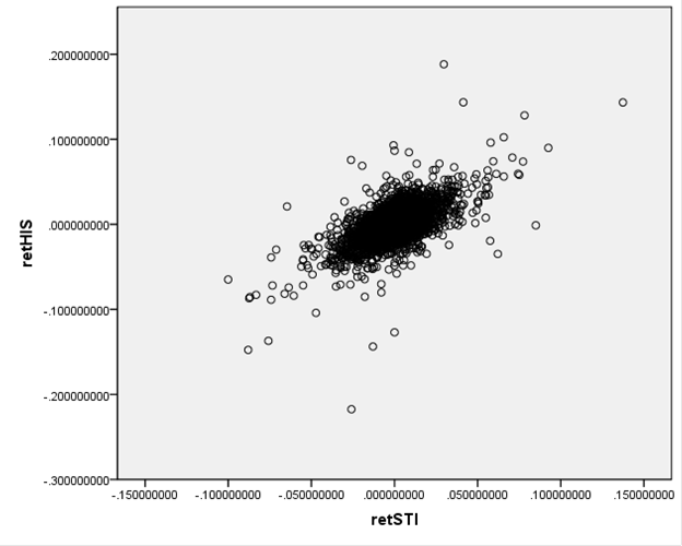
This plots the
returns of Hong Kong's Hang Seng index against the returns of Singapore's
Straits Times index (over the period from Dec 29, 1989 to Sept 1, 2010)
This next graph
shows the S&P 500 returns and interest rates (1-month Eurodollar) during Jan
2, 1990 – Sept 1, 2010.
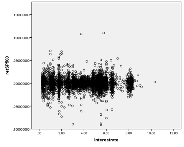
You don't have to
be a highly-skilled econometrician to see the difference in the
relationships. It would seem reasonable to
state that the Hong Kong and
We want to ask, how
could we measure these relationships?
Since these two graphs are rather extreme cases, how can we distinguish
cases in the middle? And then there is
one farther, even more important question: how can we try to guard against
seeing relationships where, in fact, none actually exist? The second question is the big one, which
most of this course (and much of the discipline of statistics) tries to
answer. But start with the first
question.
How can
we measure the relationship?
Correlation
measures how/if two variables move together.
Recall from above
that we looked at the average of ![]() when Y was a dummy
variable taking only the values of zero or one.
Return to the case where Y is not a dummy but is a continuous variable
just like X. It is still useful to find
the average of
when Y was a dummy
variable taking only the values of zero or one.
Return to the case where Y is not a dummy but is a continuous variable
just like X. It is still useful to find
the average of ![]() even in the case where
Y is from a continuous distribution and can take any value,
even in the case where
Y is from a continuous distribution and can take any value, ![]() . It is a bit more useful if we re-write X and Y as
differences from their means, so finding:
. It is a bit more useful if we re-write X and Y as
differences from their means, so finding:
![]() .
.
This is the covariance,
which is denoted cov(X,Y) or sXY.
|
A positive covariance shows
that when X is above its mean, Y tends to also be above its mean (and vice
versa) so either a positive number times a positive number gives a positive
or a negative times a negative gives a positive. A negative covariance shows
that when X is above its mean, Y tends to be below its mean (and vice
versa). So when one is positive the
other is negative, which gives a negative value when multiplied. |
A bit of math (extra):
(a strange
case because it makes FOIL look like just FL!) |
Covariance is
sometimes scaled by the standard deviations of X and Y in order to eliminate
problems of measurement units, so the correlation is:
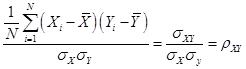 or Corr(X,Y),
where the Greek
letter "rho" denotes the correlation coefficient. With some algebra you can show that ρ is
always between negative one and positive one; ![]() .
.
Two variables will
have a perfect correlation if they are identical; they would be perfectly
inversely correlated if one is just the negative of the other (assets and
liabilities, for example). Variables
with a correlation close to one (in absolute value) are very similar; variables
with a low or zero correlation are nearly or completely unrelated.
Sample
covariances and sample correlations
Just as with the
average and standard deviation, we can estimate the covariance and correlation
between any two variables. And just as
with the sample average, the sample covariance and sample correlation will have
distributions around their true value.
Go back to the case
of the Hang Seng/Straits Times stock indexes.
We can't just say that when one is big, the other is too. We want to be a bit more precise and say that
when one is above its mean, the other tends to be above its mean, too. We might additionally state that, when the
standardized value of one is high, the other standardized value is also
high. (Recall that the standardized
value of one variable, X, is ![]() , and the standardized value of Y is
, and the standardized value of Y is ![]() .)
.)
Multiplying the two
values together, ![]() , gives a useful indicator since if both values are positive
then the multiplication will be positive; if both are negative then the
multiplication will again be positive.
So if the values of ZX and ZY are perfectly linked
together then multiplying them together will get a positive number. On the other hand, if ZX and ZY
are oppositely related, so whenever one is positive the other is negative, then
multiplying them together will get a negative number. And if ZX and ZY are
just random and not related to each other, then multiplying them will sometimes
give a positive and sometimes a negative number.
, gives a useful indicator since if both values are positive
then the multiplication will be positive; if both are negative then the
multiplication will again be positive.
So if the values of ZX and ZY are perfectly linked
together then multiplying them together will get a positive number. On the other hand, if ZX and ZY
are oppositely related, so whenever one is positive the other is negative, then
multiplying them together will get a negative number. And if ZX and ZY are
just random and not related to each other, then multiplying them will sometimes
give a positive and sometimes a negative number.
Sum up these
multiplied values and get the (population) correlation,![]() .
.
This can be written
as 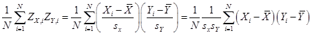 . The population
correlation between X and Y is denoted
. The population
correlation between X and Y is denoted ![]() ; the sample correlation is
; the sample correlation is ![]() . Again the difference
is whether you divide by N or (N – 1).
Both correlations are always between -1 and +1;
. Again the difference
is whether you divide by N or (N – 1).
Both correlations are always between -1 and +1; ![]() .
.
We often think of
drawing lines to summarize relationships; the correlation tells us something
about how well a line would fit the data.
A correlation with an absolute value near 1 or -1 tells us that a line
(with either positive or negative slope) would fit well; a correlation near
zero tells us that there is "zero relationship."
The fact that a
negative value can infer a relationship might seem surprising but consider for
example poker. Suppose you have figured
out that an opponent makes a particular gesture when her cards are no good –
you can exploit that knowledge, even if it is a negative relationship. In finance, if a fund manager finds two assets
that have a strong negative correlation, that one has high returns when the
other has low returns, then again this information can exploited by taking
offsetting positions.
You might commonly
see a "covariance matrix" if you were working with many variables;
the matrix shows the covariance (or correlation) between each pair. So if you have 4 variables, named
(unimaginatively) X1, X2, X3, and X4, then the covariance matrix would be:
|
|
X1 |
X2 |
X3 |
X4 |
|
X1 |
s11 |
|
|
|
|
X2 |
s21 |
s22 |
|
|
|
X3 |
s31 |
s32 |
s33 |
|
|
X4 |
s41 |
s42 |
s34 |
s44 |
Where the matrix is
"lower triangular" because cov(X,Y)=cov(Y,X) [return to the formulas
if you're not convinced] so we know that the upper entries would be equal to
their symmetric lower-triangular entry (so the upper triangle is left blank
since the entries would be redundant). And
we can also show [again, a bit of math to try on your own] that cov(X,X) =
var(X) so the entries on the main diagonal are the variances.
If we have a lot of
variables (15 or 20) then the covariance matrix can be an important way to
easily show which ones are tightly related and which ones are not.
As a practical
matter, sometimes perfect (or very high) correlations can be understood simply
by definition: a survey asking "Do you live in a city?" and "Do
you live in the countryside?" will get a very high negative correlation
between those two questions. A firm's
Assets and Liabilities ought to be highly correlated. But other correlations can be caused by the
nature of the sampling.
Higher
Moments
The third moment is
usually measured by skewness, which is a common characteristic of financial
returns: there are lots of small positive values balanced by fewer but larger
negative values. Two portfolios could
have the same average return and same standard deviation, but if one is not
symmetric distribution (so has a non-zero skewness) then it would be important
to understand this risk.
The fourth moment
is kurtosis, which measures how fat the tails are, or how fast the
probabilities of extreme values die off.
Again a risk manager, for example, would be interested in understanding
the differences between a distribution with low kurtosis (so lots of small
changes) versus a distribution with high kurtosis (a few big changes).
If these measures
are not perfectly clear to you, don't get frustrated – it is difficult, but it
is also very rewarding. As the Financial
Crisis has shown, many top risk managers at name-brand institutions did not
understand the statistical distributions of the risks that they were taking
on. They plunged the global economy into
recession and chaos because of it.
These are called "moments" to reflect the origin of the average
as being like weights on a lever or "moment arm". The average is the first moment, the variance
is the second, skewness is third, kurtosis is fourth, etc. If you take a class using Calculus to go
through Probability and Statistics, you will learn moment-generating functions.
More examples
of correlation:
It is common in
finance to want to know the correlation between returns on different assets.
First remember the
difference between the returns and the level of an asset or index!
An investment in
multiple assets, with the same return but that are uncorrelated, will have the
same return but with less overall risk.
We can show this on Excel; first we'll do random numbers to show the
basic idea and then use specific stocks.
How can we create
normally-distributed random numbers in Excel?
RAND() gives random numbers between zero and one; NORMSINV(RAND()) gives
normally distributed random numbers. (If
you want variables with other distributions, use the inverse of those
distribution functions.) Suppose that
two variables each have returns given as 2% + a normally-distributed random
number; this is shown in Excel sheet, lecturenotes3.xls
With finance data,
we use the return not just the price.
This is because we assume that investors care about returns per dollar
not the level of the stock price.
Important
Questions
·
When we
calculate a correlation, what number is "big"? Will see random errors – what amount of
evidence can convince us that there is really a correlation?
·
When we
calculate conditional means, and find differences between groups, what
difference is "big"? What
amount of evidence would convince us of a difference?
Example:
Mazar, Amir, Ariely
(2005) "Dishonesty of Honest People" [SSRN-id979648.pdf, available
online]
Students solve math
problems and report how many, of 20, were solved (offered a small reward for
success). Here is a sample question: Which 2 numbers add to 10? You can see
that finding the answer is tedious but doesn't require advanced mathematical
knowledge.
In one setup, the
students first threw out the answer sheet and then just said how many they'd
solved; in the other setup they handed over the sheet to be checked – so it was
easier to cheat in the first case.
Students who had to hand in the sheet reported solving an average of 3.1
out of 20 problems in the short time given; students who threw out the sheet
reported 4.2.
Are people more
dishonest, when given a chance to be?
Really? What information do we
need, to be more confident about our knowledge?
Ariely did another study looking at whether wearing counterfeit
sunglasses made people more likely to cheat.
To answer these, we
need to think about randomness – in other perceptual problems, what would be
called noise or blur.
Learning
Outcomes (from CFA exam
Study Session 2, Quantitative Methods)
Students will be
able to:
§ calculate and interpret relative
frequencies, given a frequency distribution, and describe the properties of a
dataset presented as a histogram;
§ define, calculate, and interpret
measures of central tendency, including the population mean, sample mean, median,
and mode;
§ define, calculate, and interpret
measures of variation, including the population standard deviation and the
sample standard deviation;
§ define and interpret the
covariance and correlation;
§ define a random variable, an
outcome, an event, mutually exclusive events, and exhaustive events;
§ distinguish between dependent and
independent events;
Probability
Beyond presenting
some basic measures such as averages and standard deviations, we want to try to
understand how much these measures can tell us about the larger world. How likely is it, that we're being fooled,
into thinking that there's a relationship when actually none exists? To think through these questions we must
consider the logical implications of randomness and often use some basic statistical
distributions (discrete or continuous).
Think
Like a Statistician
The basic question
that a Statistician must ask is "How likely is it, that I'm being
fooled?" Once we accept that the
world is random (rather than a manifestation of some god's will), we must
decide how to make our decisions, knowing that we cannot guarantee that we will
always be right. There is some risk that
the world will seem to be one way, when actually it is not. The stars are strewn randomly across the sky
but some bright ones seem to line up into patterns. So too any data might sometimes line up into
patterns.
Statisticians tend
to stand on their heads and ask, suppose there were actually no
relationship? (Sometimes they ask,
"suppose the conventional wisdom were true?") This statement, about "no
relationship," is called the Null
Hypothesis, sometimes abbreviated as H0. The Null Hypothesis is tested against an Alternative Hypothesis, HA.
Before we even
begin looking at the data we can set down some rules for this test. We know that there is some probability that
nature will fool me, that it will seem as though there is a relationship when
actually there is none. The statistical
test will create a model of a world where there is actually no relationship and
then ask how likely it is that we could see what we actually see, "How
likely is it, that I'm being fooled?"
What if there were actually no relationship, is there some chance that I
could see what I actually see?
Randomness
in Sports
As an example,
consider sports events. As any sports
fan knows, a team or individual can get lucky or unlucky. The baseball World Series, for example, has
seven games. It is designed to ensure
that, by the end, one team or the other wins.
But will the better team always win?
First make a note
about subjectivity: if I am a fan of the team that won, then I will be
convinced that the better team won; if I'm a fan of the losing team then I'll
be certain that the better team got unlucky.
But fans of each team might agree, if they discussed the question before
the Series were played, that luck has a role.
Will the better
team win? Clearly a seven-game Series
means that one team or the other will win, even if they are exactly matched (if
each had precisely a 50% chance of winning).
If two representatives tossed a coin in the air seven times, then one or
the other would win at least four tosses – maybe even more. We can use a computer to simulate seven
coin-tosses by having it pick a random number between zero and one and defining
a "win" as when the random number is greater than 0.5.
Or instead of
having a computer do it, we could use a bit of statistical theory.
Some
math
Suppose we start
with just one coin-toss or game (baseball uses 7 games to decide a champion;
football uses just one). Choose to focus
on one team so that we can talk about "win" and
"loss". If this team has a
probability of winning that is equal to p,
then it has a probability of losing equal to (1-p). So even if p, the
probability of winning, is equal to 0.6, there is still a 40% chance that it
could lose a single game. In fact unless
the probability of winning is 100%, there is some chance, however remote, that
the lesser team will win.
What about if they
played two games? What are the
outcomes? The probability of a team
winning both games is p*p = p2. If the probability were 0.5 then the
probability of winning twice in a row would be 0.25.
A table can show
this:
|
|
Win Game 1 {p} |
Lose Game 1 {1-p} |
|
Win Game 2 {p} |
outcome: W,W |
L,W |
|
Lose Game 2 {1-p} |
W,L |
L,L |
This is a
fundamental fact about how probabilities are represented mathematically: if the
probabilities are not related (i.e. if the tossed coin has no memory) then the
probability of both events happening is found my multiplying the probabilities
of each individual outcome. (What if
they're not unrelated, you may ask? What
if the first team that wins gets a psychological boost in the next so they're
more likely to win the second game? Then
the math gets more complicated – we'll come back to that question!)
The math notation
for two events, call them A and B, both happening is:
![]()
The fundamental
fact of independence is then represented as:
![]()
where we use the
term "independent" for when there is no relationship between them.
The probability
that a team could lose both games is (1-p)*(1-p) = (1-p)2. The probability that the teams could split
the series (each wins just one) is p*(1-p) + (1-p)*p = 2p(1-p). There are two ways that each team could win
just one game: either the series splits (Win,Loss) or (Loss,Win).
For three games the
outcomes become more complicated: now there are 8 combinations of win and loss:
|
(W,W,W) |
(W,W,L) |
(W,L,W) |
(L,W,W) |
(W,L,L) |
(L,W,L) |
(L,L,W) |
(L,L,L) |
|
p*p*p |
p*p*(1-p) |
p*(1-p)p |
(1-p)p*p |
p(1-p)(1-p) |
(1-p)p(1-p) |
(1-p)(1-p)p |
(1-p)(1-p)(1-p) |
and the
probabilities are in the row below.
The team will win
the series in any of the left-most 4 outcomes so its overall probability of
winning the series is
![]()
while its
probability of losing the series is
![]() .
.
Clearly if p is 0.5
so that p=(1-p) then the chances of either team winning the three-game series
are equal. If the probabilities are not
equal then the chances are different, but as long as there is a probability not
equal to one or zero (i.e. no certainty) then there is a chance that the worse
team could win.
If you keep on
working out the probabilities for longer and longer series you might notice that
the coefficients and functional forms are right out of Pascal's Triangle. This is your first notice of just how
"normal" the Normal Distribution is, in the sense that it jumps into
all sorts of places where you might not expect it. The terms of Pascal's Triangle begin (as N
becomes large) to have a normal distribution!
We'll come back to this again...
Terms
and Definitions
Some basics: a
sample space is the entire list of possible outcomes (can be whole long list or
even mathematical sets such as real numbers); events are subsets of the sample
space. Simple event is a single outcome
(one dice comes up 6); a compound event is several outcomes (both dice come up
6). Notate an event as A. The complement of the event is the set of all
events that are not in A; this is A'.
The events must be mutually exclusive and exhaustive, so a
good deal of the hard work in probability is just figuring out how to list all
of the events.
Mutually exclusive
means that the events must be clearly defined so that the data observed can be
classified into just one event.
Exhaustive means that every possible data observed must fit into some event. The "mutually exclusive" part means
that probabilities can be added up, so that if the probability of rolling a
"1" on a dice is 1/6 and the probability of rolling a 6 is 1/6, then
the probability of rolling either a 1 or 6 is 2/6 = 1/3. The "exhaustive" part of defining
the events means that the sum of all the events must equal one.
For example,
suppose we roll two dice. We might want
to think of "die #1 comes up as 6" as one event [in English, the
singular of "dice" is "die" – how morbid gambling can
be!]. But the other die can have 6
different values without changing the value of the first die. So a better list of events would be the
integers from 2 to 12, the sum of the dice values – with the note that there
are many ways of achieving some of the events (a 7 is a 6 &1 or a 5&2,
or 4&3, or 3&4, or 2&5, or 1&6) while other events have only
one path (each die comes up 6 to make 12).
A sample space is the set of all possible
events. The sum of the probability of
all of the events in the sample space is equal to one. There is a 100% chance that something happens
(provided we've defined the sample space correctly). So if a lottery brags that there is a 2%
chance that "you might be a winner!" this is equivalent to stating
that there is a 98% chance that you'll lose.
Events have probability; this must lie between zero
and one (inclusive); so ![]() . The probability of
all of the events in the sample space must sum to one. This means that the probability of an event
and its complement must sum to one:
. The probability of
all of the events in the sample space must sum to one. This means that the probability of an event
and its complement must sum to one: ![]() .
.
Probabilities come
from empirical results (relative frequency approach) or the classical (a priori
or postulated) assignment or from subjective beliefs that people have.
In empirical
approach, the Law of Large Numbers
is important: as the number of identical trials increases, the estimated
frequency approaches its theoretical value.
You can try flipping coins and seeing how many come up heads (flip a bunch at a time to speed up the process); it should be
50%.
We are often
interested in finding the probability of two events both happening; this is the
"intersection" of two
events; the logical "and" relationship; two things both
occurring. In the PUMS data we might
want to find how many females have a college degree; in poker we might care
about the chance of an opponent having an ace as one of her hole cards and the
dealer turning up a king. We notate the
intersection of A and B as ![]() and want to find
and want to find ![]() . In SPSS this is
notated with "&".
. In SPSS this is
notated with "&".
The "union" of two events is the
logical "or" so it is either of two events occurring; this is ![]() so we might consider
so we might consider ![]() or, in SPSS,
"|". In the PUMS data we might
want to combine people who report themselves as having race "black"
with those who report "black – white". In cards,
it is the probability that any of my 3 opponents has a better hand.
or, in SPSS,
"|". In the PUMS data we might
want to combine people who report themselves as having race "black"
with those who report "black – white". In cards,
it is the probability that any of my 3 opponents has a better hand.
Married people can
buy life insurance policies that pay out either when the first person dies or
after both die – logical and vs or.
Venn Diagrams
(Ballantine)
![]()
General Law of Addition
![]()
and so ![]()
Mutually Exclusive (Special Law of
Addition),
If ![]() then
then ![]() and
and ![]()
Conditional Probability
![]() if
if ![]() . See Venn Diagram.
. See Venn Diagram.
Independent
Events
A is independent of
B if and only if ![]()
If we have multiple
random variables then we can consider their Joint Distribution: the probability associated with each outcome in
both sample spaces. So a coin flip has a
simple discrete distribution: a 50% chance of heads and a 50% chance of
tails. Flipping 2 coins gives a joint
distribution: a 25% chance of both coming up heads, a 25% chance of both coming
up tails, and a 50% chance of getting one head and one tail.
The probability of
multiple independent events is found by multiplying the probabilities of each
event together. So the chance of rolling
two 6 on two dice is ![]() . The probability of
getting to the computer lab on the 6th floor of NAC from the first
floor, without having to walk up a broken escalator, can be found this way
too. Suppose the probability of an
escalator not working is
. The probability of
getting to the computer lab on the 6th floor of NAC from the first
floor, without having to walk up a broken escalator, can be found this way
too. Suppose the probability of an
escalator not working is ![]() ; then the probability of it working is
; then the probability of it working is ![]() and the probability of
five escalators each working is
and the probability of
five escalators each working is ![]() . So even if the
probability of a breakdown is small (5%), still the probability of having every
escalator work is just
. So even if the
probability of a breakdown is small (5%), still the probability of having every
escalator work is just ![]() so this implies that
you'd expect to walk more than once a week.
so this implies that
you'd expect to walk more than once a week.
A simple
representation of the joint distribution of two coin flips is a table:
|
|
coin 1 Heads |
coin 1 Tails |
|
coin 2 Heads |
H,H at 25% |
H,T at 25% |
|
coin 2 Tails |
T,H at 25% |
T,T at 25% |
Where, since the
outcomes are independent, we can just multiply the probabilities.
The Joint
Distribution tells the probabilities of all of the different outcomes. A Marginal
Distribution answers a slightly different question: given some value of one
of the variables, what are the probabilities of the other variables?
When the variables
are independent then the marginal distribution does not change from the joint
distribution. Consider a simple example
of X and Y discrete variables. X takes
on values of 1 or 2 with probabilities of 0.6 and 0.4 respectively. Y takes on values of 1, 2, or 3 with
probabilities of 0.5, 0.3, and 0.2 respectively. So we can give a table like this:
|
|
X=1 (60%) |
X=2 (40%) |
|
|
Y=1 (50%) |
(1,1) at probability 0.3 |
(2,1) at probability 0.2 |
|
|
Y=2 (30%) |
(1,2) at probability 0.18 |
(2,2) at probability 0.12 |
|
|
Y=3 (20%) |
(1,3) at probability 0.12 |
(2,3) at probability 0.08 |
|
|
|
|
|
|
On the assumption
that X and Y are independent. The
probabilities in each box are found by multiplying the probability of each
independent event.
If instead we had
the two variables, A and B, not being independent then we might have a table
more like this:
|
|
A=1 |
A=2 |
|
|
B=1 |
(1,1) at probability 0.25 |
(2,1) at probability 0.13 |
|
|
B=2 |
(1,2) at probability 0.23 |
(2,2) at probability 0.12 |
|
|
B=3 |
(1,3) at probability 0.17 |
(2,3) at probability 0.1 |
|
|
|
|
|
|
We will examine the
differences.
If we add up the
probabilities along either rows or columns then we get the marginal probabilities (which we write in the margins, appropriately enough).
Then we'd get:
|
|
X=1 (60%) |
X=2 (40%) |
|
|
Y=1 (50%) |
(1,1) at probability 0.3 |
(2,1) at probability 0.2 |
0.5 |
|
Y=2 (30%) |
(1,2) at probability 0.18 |
(2,2) at probability 0.12 |
0.3 |
|
Y=3 (20%) |
(1,3) at probability 0.12 |
(2,3) at probability 0.08 |
0.2 |
|
|
0.6 |
0.4 |
|
Which just
re-states our assumption that the variables are independent – and shows that,
where there is independence, the probability of either variable alone does not
depend on the value that the other variable takes on. In other words, knowing X does not give me
any information about the value that Y will take on, and vice versa.
If instead we do
this for the A,B case we get:
|
|
A=1 |
A=2 |
|
|
B=1 |
(1,1) at probability 0.25 |
(2,1) at probability 0.13 |
0.38 |
|
B=2 |
(1,2) at probability 0.23 |
(2,2) at probability 0.12 |
0.35 |
|
B=3 |
(1,3) at probability 0.17 |
(2,3) at probability 0.1 |
0.27 |
|
|
0.65 |
0.35 |
|
Where we double
check that we've done it right by seeing that the sum of either of the
marginals is equal to one (65% + 35% = 100% and 38% + 35% + 27% = 100%).
So the marginal
distributions sum the various ways that an outcome can happen. For example, we can get A=1 in any of 3 ways:
either (1,1), (1,2) or (1,3). So we add
the probabilities of each of these outcomes to find the total chance of getting
A=1.
But if we want to
understand how A and B are related, it might be more useful to consider this as
a prediction problem: would knowing the value that A takes on help me guess the
value of B? Would knowing the value that
B takes on help me guess the value of A?
These are abstract
questions but they have vitally important real-life analogs. In airport security, is the probability that
someone is a terrorist independent of whether they are Muslim? Is the probability that someone is pulled out
of line for a thorough search independent of whether they are Muslim? (The TSA might have different beliefs
than you or me!) In medicine,
is the probability that someone gets cancer independent of whether they eat
lots of vegetables? In economics, is the
probability that someone defaults on their mortgage independent of the mortgage
originator (Fannie, Freddie, mortgage broker, bank)? Is the probability of the country pulling out
of recession independent of whether the Fed raises rates? In poker, if my opponent just raised the bid,
what is the probability that her cards are better than mine?
For these questions
we want to find the conditional distribution: what is the probability of some
outcome, given a particular value for some other random variable?
Just from the
phrasing of the question, you should be able to see that if the two variables
are independent then the conditional distribution should not change from the
marginal distribution – as is the case of X and Y. Flipping a coin does not help me guess the
outcome of a roll of the dice. (Cheering
in front of a sports game on TV does not affect the outcome, for another
example – although plenty of people act as though they don't believe that!)
How do we find the
conditional distribution? Take the value
of the joint distribution and divide it by the marginal distribution of the
relevant variable.
For example,
suppose we want to find the probability of B outcomes, conditional on A=1. Since we know that A=1, there is no longer a
65% probability of A -- it happened. So
we divide each joint probability by 0.65 so that the sum will be equal to
1. So the probabilities are now:
|
|
A=1 |
A=2 |
|
|
B=1 |
(1,1) at probability 0.25/.65 |
(2,1) at
probability 0.13 |
0.38 |
|
B=2 |
(1,2) at probability 0.23/.65 |
(2,2) at
probability 0.12 |
0.35 |
|
B=3 |
(1,3) at probability 0.17/.65 |
(2,3) at
probability 0.1 |
0.27 |
|
|
0.65/.65 |
0.35 |
|
so now we get the
conditional distribution:
|
|
A=1 |
A=2 |
|
|
B=1 |
(1,1) @ 0.3846 |
(2,1) at probability 0.13 |
0.38 |
|
B=2 |
(1,2) @ 0.3538 |
(2,2) at probability 0.12 |
0.35 |
|
B=3 |
(1,3) @ 0.2615 |
(2,3) at probability 0.1 |
0.27 |
|
|
|
0.35 |
|
We could do the
same to find the conditional distribution of B, given that A=2:
|
|
A=1 |
A=2 |
|
|
B=1 |
(1,1) at probability 0.25 |
(2,1) @ 0.13/.35 =.3714 |
0.38 |
|
B=2 |
(1,2) at probability 0.23 |
(2,2) @ 0.12/.35 = .3429 |
0.35 |
|
B=3 |
(1,3) at probability 0.17 |
(2,3) @ 0.1/.35 = .2857 |
0.27 |
|
|
0.65 |
|
|
These conditional
probabilities are denoted as ![]() for example. We could find the expected value of B given
that A equals 2,
for example. We could find the expected value of B given
that A equals 2, ![]() , just by multiplying the value of B by its probability of
occurrence, so
, just by multiplying the value of B by its probability of
occurrence, so ![]() .
.
We could find the
conditional probabilities of A given B=1 or given B=2 or given B=3. In those cases we would sum across the rows
rather than down the columns.
More pertinently,
we can get crosstabs (on SPSS, "Analyze" then "Descriptive
Statistics" then "Crosstabs") on two variables, for example the
native/foreign born in each borough,
|
|
|
foreign_born |
Total |
|
|
|
|
0 |
1 |
|
|
Boroughs |
Bronx |
33955 |
15928 |
49883 |
|
Manhattan |
40511 |
15632 |
56143 |
|
|
Staten Is |
16074 |
3971 |
20045 |
|
|
Brooklyn |
62464 |
37324 |
99788 |
|
|
Queens |
48193 |
41719 |
89912 |
|
|
Total |
201197 |
114574 |
315771 |
|
To get the joint
probabilities, we divide the counts by the grand total,
|
native |
foreign |
|
|
Bronx |
0.1075 |
0.0504 |
|
Manhattan |
0.1283 |
0.0495 |
|
Staten Is |
0.0509 |
0.0126 |
|
Brooklyn |
0.1978 |
0.1182 |
|
Queens |
0.1526 |
0.1321 |
Then get the
marginals:
|
native |
foreign |
||
|
Bronx |
0.1075 |
0.0504 |
0.1580 |
|
Manhattan |
0.1283 |
0.0495 |
0.1778 |
|
Staten Is |
0.0509 |
0.0126 |
0.0635 |
|
Brooklyn |
0.1978 |
0.1182 |
0.3160 |
|
Queens |
0.1526 |
0.1321 |
0.2847 |
|
0.6372 |
0.3628 |
These show that, in
NYC, 64% are natives and 36% are foreign-born.
The most populous boroughs are Brooklyn and Queens, each with about 30%
of the city's population, while Manhattan and the Bronx each have about 15% and
tiny Staten Island has just over 6%.
Then the
conditional probabilities. Conditional
on being native born,
|
native |
foreign |
||
|
Bronx |
0.1688 |
0.0504 |
0.1580 |
|
Manhattan |
0.2013 |
0.0495 |
0.1778 |
|
Staten Is |
0.0799 |
0.0126 |
0.0635 |
|
Brooklyn |
0.3105 |
0.1182 |
0.3160 |
|
Queens |
0.2395 |
0.1321 |
0.2847 |
|
0.6372 |
0.3628 |
So 31% of the
natives live in Brooklyn, 24% in Queens, 20% in Manhattan, 17% in the Bronx, and
8% in Staten Island. So a larger
fraction of natives (relative to overall population share) is in Manhattan and
Staten Island while a much lower fraction of native-born are in Queens.
Conditional on
being foreign born,
|
native |
foreign |
||
|
Bronx |
0.1075 |
0.1390 |
0.1580 |
|
Manhattan |
0.1283 |
0.1364 |
0.1778 |
|
Staten Is |
0.0509 |
0.0347 |
0.0635 |
|
Brooklyn |
0.1978 |
0.3258 |
0.3160 |
|
Queens |
0.1526 |
0.3641 |
0.2847 |
|
0.6372 |
0.3628 |
So 36% of
immigrants live in Queens (relative to 28% of the population overall), 33% in
Brooklyn, 14% in the Bronx and Manhattan, and just 3% in Staten Island.
The relative
fractions of native/immigrant by borough (so conditional probabilities) is
|
native |
foreign |
||
|
Bronx |
0.6807 |
0.3193 |
0.1580 |
|
Manhattan |
0.7216 |
0.2784 |
0.1778 |
|
Staten Is |
0.8019 |
0.1981 |
0.0635 |
|
Brooklyn |
0.6260 |
0.3740 |
0.3160 |
|
Queens |
0.5360 |
0.4640 |
0.2847 |
|
0.6372 |
0.3628 |
So the borough with
the highest fraction of immigrants is Queens (a 54-46 split), followed by
Brooklyn, the Bronx, Manhattan, and Staten Island (where natives outnumber immigrants
by 4-to-1).
Conditional
probabilities can also be calculated with what is called Bayes' Theorem:
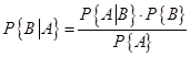 .
.
This can be
understood by recalling the definition of conditional probability, ![]() , so
, so ![]() , that the conditional probability equals the joint
probability divided by the marginal probability.
, that the conditional probability equals the joint
probability divided by the marginal probability.
The power of Bayes'
Theorem can be understood by thinking about medical testing. Suppose a genetic test screens for some
disease with 99% accuracy. Your test
comes back positive – how worried should you be? The surprising answer is not 99% worried; in
fact often you might be more than likely to be healthy! Suppose that the disease is rare so only 1
person in 1000 has it (so 0.1%). So out
of 1000 people, one person has the disease and the test is 99% likely to
identify that person. Out of the
remaining 999 people, 1% will be misidentified as having the disease, so this
is 9.99 – call it 10 people. So eleven
people will test positive but only one will actually have the disease so the
probability of having the disease given that the test comes up positive, ![]() , is
, is 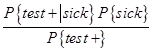 =
= ![]() .
.
The test is not at
all useless – it has brought down an individual's likelihood of being sick by
orders of magnitude, from one-tenth of one percent to ten percent. But it's still not nearly as accurate as the
"99%" label might imply.
Many healthcare
providers don't quite get this and explain it merely as "don't be too
worried until we do further tests."
But this is one reason why broad-based tests can be very expensive and
not very helpful. These tests are much
more useful if we first narrow down the population of people who might have the
disease. For example home pregnancy
tests might be 99% accurate but if you randomly selected 1000 people to take
the test, you'd find many false positives.
Some of those might be guys (!) or women who, for a variety of reasons,
are not likely to be pregnant. The test
is only useful as one element of a screen that gets progressively finer and
finer.
Counting
Rules
If A can occur as N1
events and B can be N2 events then the sample space is ![]() (visualize a
contingency table with N1 rows and N2 columns).
(visualize a
contingency table with N1 rows and N2 columns).
Factorials: If there are N items then
they can be arranged in ![]() ways.
ways.
Permutations: n events that can occur in r
items (where order is important) have a total of ![]() possible outcomes.
possible outcomes.
Combinations: n events that can occur
in r items (where order is not important) have ![]() possible outcomes –
just the permutation divided by r! to take care of the multiple ways of
ordering.
possible outcomes –
just the permutation divided by r! to take care of the multiple ways of
ordering.
So to apply these,
consider computer passwords (see NYTimes article below).
The article
reports:
Mr. Herley,
working with Dinei Florêncio, also at Microsoft Research, looked at the
password policies of 75 Web sites. ... They reported that the sites that
allowed relatively weak passwords were busy commercial destinations, including
PayPal, Amazon.com and Fidelity
Investments. The sites that insisted on very complex passwords were mostly
government and university sites. What accounts for the difference? They suggest
that “when the voices that advocate for usability are absent or weak, security
measures become needlessly restrictive.”
Consider the simple
mathematics of why a government or university might want complex
passwords. How many permutations are
possible if passwords are 6 numerical digits?
How many if passwords are 6 alphabetic or numeric characters? If the characters are alphabetic, numeric,
and fifteen punctuation characters (, . _ - ? ! @ # $ % ^ & * '
")? What if passwords are 8
characters? If each login attempt takes
1/100 of a second, how many seconds of "brute-force attack" does it
take to access the account on average?
If there is a penalty of 10 minutes after 3 unsuccessful login attempts,
how long would it take to break in? (Of
course, the article notes, if password requirements are so arcane that
employees put their passwords on a Post-It attached to the monitor, then the
calculations above are irrelevant.)
( for fun, here's another example of
Joint/Marginal Distributions)
Tiger Mother Amy Chua in WSJ, Jan 8, 2011
A lot of people wonder how Chinese
parents raise such stereotypically successful kids. They wonder what these
parents do to produce so many math whizzes and music prodigies, what it's like
inside the family, and whether they could do it too. Well, I can tell them,
because I've done it. Here are some things my daughters, Sophia and Louisa,
were never allowed to do:
• attend a sleepover
• have a playdate
• be in a school play
• complain about not being in a
school play
• watch TV or play computer games
• choose their own extracurricular
activities
• get any grade less than an A
• not be the No. 1 student in every
subject except gym and drama
• play any instrument other than
the piano or violin
• not play the piano or violin.
I'm using the term "Chinese
mother" loosely. I know some Korean, Indian, Jamaican, Irish and Ghanaian
parents who qualify too. Conversely, I know some mothers of Chinese heritage,
almost always born in the West, who are not Chinese mothers, by choice or
otherwise. I'm also using the term "Western parents" loosely. Western
parents come in all varieties.
So you could go to PUMS and look at
first-generation immigrants with parents from China, compare with other first-generation
kids, see where are the Tiger Moms...