|
Cool Statistics! Econ 29000 Kevin R Foster, CCNY Spring 2011 |
|
|
Stats pervade our everyday life, particularly online. Google is dominant in search because they've figured out how to give people what they want – even if it is sometimes odd. Here's an example of using its "auto-complete" feature:

from http://www.boingboing.net/2010/01/11/using-google-to-lear.html
Smart uses of stats drive many top companies, from Google to Netflix with its movie suggestions to Amazon's "people who bought ... also bought ..." suggestions.
Hal Varian, chief economist at Google and previous Dean of the business school at Berkeley, notes “I keep saying that the sexy job in the next 10 years will be statisticians. And I’m not kidding.” (New York Times, August 9, 2009, "For Today's Graduate, Just One Word: Statistics.")
Of course economics is built on statistics, from GDP to unemployment to interest rates or consumer confidence.
We can use statistics to learn about the world and try to overcome our misconceptions, as in this presentation from the TED talks by Hans Rosling, 2006, http://www.ted.com/talks/hans_rosling_shows_the_best_stats_you_ve_ever_seen.html
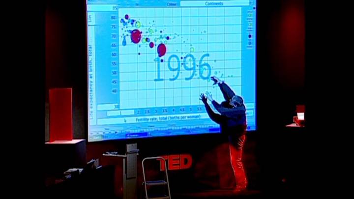
Where he explains why his students are dumber than chimps.
We can use graphic displays to dramatize an argument:
![]()
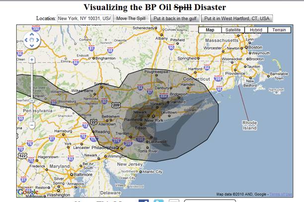
from http://www.ifitwasmyhome.com/
One of the earliest time-series charts, showing the effect of war on Great Britain's national debt, is due to William Playfair (credited as being the inventor of the pie chart, bar chart, and other displays still in use today):
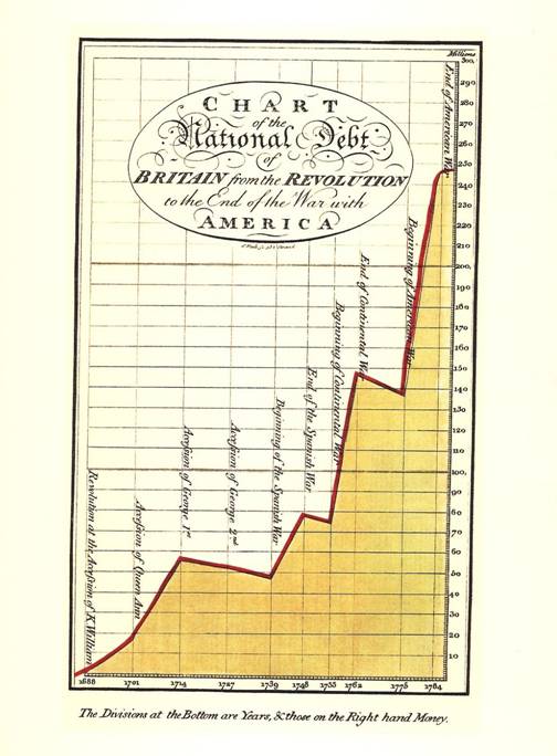
This chart shows the British debt from "the Revolution" (i.e. the Glorious Revolution when William and Mary ascended) to the end of the American Revolution.
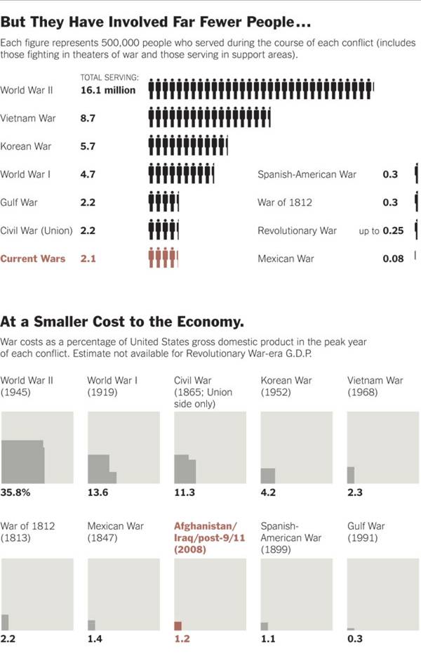
Recent charts from the NYTimes looked at the costs of American wars (Week In Review July 25, 2010):
http://www.nytimes.com/interactive/2010/07/25/weekinreview/25marsh.html?ref=weekinreview

The modern guru of graphical display is Edward Tufte. This illustration, which he commonly uses and indentifies as "probably the best statistical graphic ever drawn", is by Charles Joseph Minard:
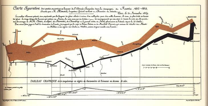
This shows Napoleon's invasion of
Wainer (among others) also pick out another important innovation, the early graphical display which had the most immediate improving effect on human welfare, by John Snow.
Snow's map shows deaths from cholera (the dots) as well as
the location of well pumps (the x's) in
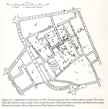
The story tells that Snow went to the
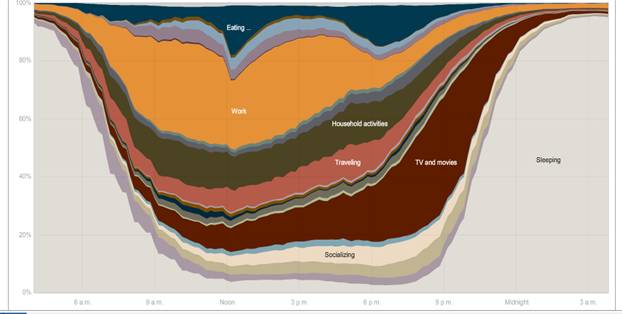
There are many modern uses and surveys. The NY Times had this graphic showing the different uses of time during the day, gathered from the American Time Use Survey (which we'll use in class). Here http://www.nytimes.com/interactive/2009/07/31/business/20080801-metrics-graphic.html is the full interactive chart where you can compare the time use patterns of men and women, employed and unemployed, and other groups . (The article is http://www.nytimes.com/2009/08/02/business/02metrics.html?_r=2)
You can just browse online to find many beautiful examples of data presentation. Some are more effective as art; some are better at presenting the data.
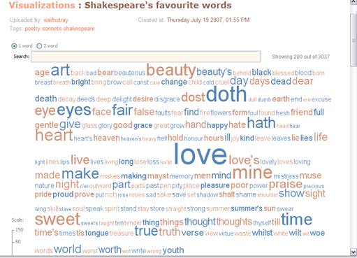
Many Eyes, from IBM, http://manyeyes.alphaworks.ibm.com/manyeyes/page/Visualization_Options.html, gives an overview of both the classics and more recent innovations such as word clouds.
Here is a word-cloud image of Shakespeare's most-used words,
A "wordle" is a slightly more artsy version:

Visual Complexity has some beautiful images, http://www.visualcomplexity.com/vc/.
Such as this one on NYC Subway Ridership 1905-2006, http://diametunim.com/shashi/nyc_subways/
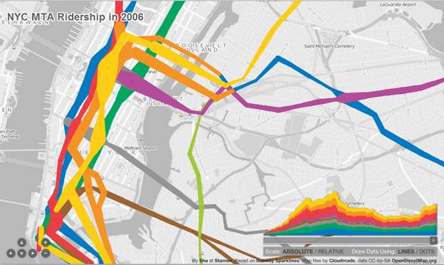
Note the slider on the right to change the time back to 1905.
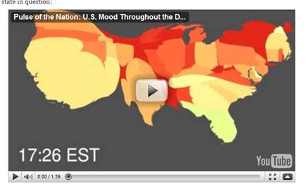
Or here is a map of the moods of different places in the US, based on an analysis of Twitter feeds,
http://www.visualisingdata.com/index.php/2010/07/twitter-visualisation-of-happiness/
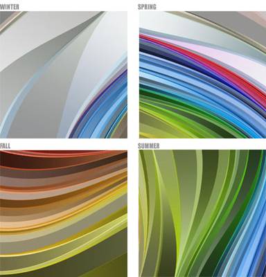
Here, from http://hint.fm/, is "the relative proportions of different colors seen in Flickr photos taken in each month of the year, and plotted ... on a wheel."

Here is an enlargement of the contrasts:
Here is "Random Walk" which displays visuals of randomness, of no order at all (best if you know German since even the English version retains much of its original language).
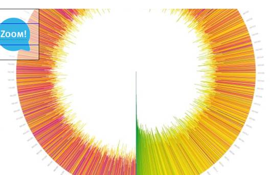
This design shows the density of prime numbers in increasing 400-cell bands, showing a dimunition at first but then a random array.
The visualization shows lines in a circle each representing 400 natural numbers. The more prime numbers there are within each package of 400 numbers, the longer the line grows towards the center of the circle. There is no regularity within the different lengths of the lines – the number of primes is randomly distributed in each package. However, in the long term a spiral is generated suggesting a decrease of the density of prime numbers in higher number ranges.
Finally, here is an interesting site that uses Amazon's Mechanical Turk (which blasts simple calculations to many human workers) to do things like rate pictures, to determine how attractiveness changes with age for men and women:
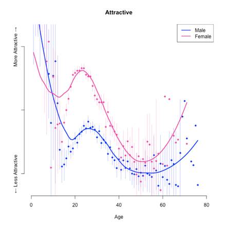
Where, except for babies, women are consistently rated as more attractive although the variation across age is interesting. The whole paper about perceptions of people based on thumbnail pictures is here.
Then there are the awful statistics. From Damned Lies and Statistics, Joel Best nominates the single worst, http://books.google.com/books?id=685UteNN_4AC&dq=best+statistics&printsec=frontcover&source=in&hl=en&ei=05pNTMK1MYH58AaGook0&sa=X&oi=book_result&ct=result&resnum=11&ved=0CEsQ6AEwCg#v=onepage&q&f=false
When I read the quotation, I assumed the student had made an error in copying it. I went to the library and looked up the article the student had cited. There, in the journal's 1995 volume, was exactly the same sentence: "Every year since 1950, the number of American children gunned down has doubled."
(Note that 245 is more than 35 trillion.)
|
How? |
|
|
Hopefully you're convinced that you want to learn stats. How can you best do it? Last term's students provided advice on a survey: "Don't take the class lightly. Make sure you take your time and make sure that you understand everything," "Study every day," "do every homework," "form a study group."
Specifically, by the end of the class you should have the following skills:
Students will be able to apply mathematically rigorous analysis to topics such as analyzing data tables, hypothesis testing, and regression analysis.
Students can expect to learn topics in four basic areas:
1. creating and interpreting basic statistics on large datasets
o mean
o median
o measures of spread
2. creating and interpreting data tabulations including
o crosstabs of counts and fractions
o marginal and conditional probabilities
o conditional means
3. conducting hypothesis tests for equality of two means and regression t-tests including
o calculating areas under t and normal distributions; calculating t-value
o getting critical values
o creating confidence intervals
o determining p-values
o explaining significance test results including Type I/Type II error
4. determining regression coefficients using statistical software such as SPSS
o explaining the coefficient estimates as slope values
o testing statistical significance of these estimates
o with datasets with thousands of observations
Examples:
Topic Area 2
Using ATUS data from 2003-2009, we look at the crosstabs of race and ethnicity; this gives the number of each group:
|
|
Native American Indian / Inuit / Hawaiian |
Asian |
African-American |
White |
Total |
|
Non-Hispanic |
1440 |
2834 |
12385 |
69721 |
86380 |
|
Hispanic |
325 |
77 |
337 |
11659 |
12398 |
|
Total |
1765 |
2911 |
12722 |
81380 |
98778 |
The fractions of each demographic category are:
|
|
Native American Indian / Inuit / Hawaiian |
Asian |
African-American |
White |
Total |
|
Non-Hispanic |
0.014578145 |
0.0286906 |
0.1253822 |
0.7058353 |
0.8744862 |
|
Hispanic |
0.003290206 |
0.0007795 |
0.0034117 |
0.1180324 |
0.1255138 |
|
Total |
0.017868351 |
0.0294701 |
0.1287939 |
0.8238677 |
|
Conditional by row:
|
|
Native American Indian / Inuit / Hawaiian |
Asian |
African-American |
White |
|
Non-Hispanic |
0.016670526 |
0.0328085 |
0.1433781 |
0.8071429 |
|
Hispanic |
0.026213905 |
0.0062107 |
0.0271818 |
0.9403936 |
So 14% of non-Hispanics are African-American while just 2.7% of Hispanics are African-American.
Conditional by column:
|
|
Native American Indian / Inuit / Hawaiian |
Asian |
African-American |
White |
|
Non-Hispanic |
0.815864023 |
0.9735486 |
0.9735105 |
0.8567338 |
|
Hispanic |
0.184135977 |
0.0264514 |
0.0264895 |
0.1432662 |
Alternately, 97% of African-Americans are not Hispanic while just 86% of whites are not Hispanic. Native Americans are the most Hispanic ethnic group.
Topic Areas 1 & 4
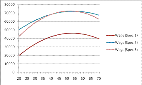
Using 2010 CPS data, restrict to only fulltime workers with a non-zero wage. Regression will have earnings (annual wage and salary) as the dependent variable.
The first set of basic explanatory variables is hypothesized to be factors such as age, sex, education, race/ethnicity, marital status, veteran status, and if a union member.
Average values of regression variables, for this subset, are:
|
Wage/Salary (annual) |
$ 49,773.79 |
||
|
Age |
41.88 |
||
|
Female |
44.5% |
||
|
White |
79.7% |
||
|
African-American |
11.8% |
||
|
Asian-American |
5.8% |
||
|
Native American/ Indian/ Alaskan/ Inuit/ Hawaiian |
2.8% |
||
|
Hispanic |
16.1% |
||
|
Mexican |
9.8% |
||
|
Puerto Rican |
1.4% |
||
|
Cuban |
0.6% |
||
|
Immigrant |
17.5% |
||
|
1 or more Parents were immigrants |
23.8% |
||
|
Education: no high school |
8.6% |
||
|
Education: High School Diploma |
28.9% |
||
|
Education: Some College (incl no degree or Assoc degree) |
27.9% |
||
|
Education: Some College but no degree |
17.5% |
||
|
Education: Associate in vocational |
5.0% |
||
|
Education: Associate in academic |
5.4% |
||
|
Education: 4-yr degree |
22.5% |
||
|
Education: Advanced Degree |
12.1% |
||
|
Married |
62.0% |
||
|
Divorced or Widowed or Separated |
14.8% |
||
|
Unmarried |
23.2% |
||
|
Union member |
2.2% |
||
|
Veteran (any) |
7.4% |
||
The regression estimates are made with three basic specifications: Spec 1 has just the listed variables; Spec 2 included dummies for industry, occupation, and state of residence; Spec 3 has dummy interactions for female*age, African-American*age, female*African-American*age, Hispanic*age, female*Hispanic*age, and female*education. An asterisk indicates statistical significance.
|
Spec 1 |
Spec 2 |
Spec 3 |
||||||
|
Coefficient std. error |
Coefficient std. error |
Coefficient std. error |
||||||
|
intercept |
-$28,685.56 |
* |
$13,744.52 |
* |
-$10,978.43 |
* |
||
|
1954.106 |
3025.180 |
3685.959 |
||||||
|
Age |
$2,517.92 |
* |
$2,012.04 |
* |
$3,052.09 |
* |
||
|
93.814 |
88.514 |
133.158 |
||||||
|
Age-squared |
-$23.60 |
* |
-$18.55 |
* |
-$29.40 |
* |
||
|
1.055 |
.994 |
1.504 |
||||||
|
Female |
-$17,380.74 |
* |
-$14,587.20 |
* |
$26,912.27 |
* |
||
|
360.019 |
393.294 |
4202.955 |
||||||
|
African American |
-$6,136.77 |
* |
-$5,315.62 |
* |
$17,924.27 |
* |
||
|
552.138 |
545.564 |
7559.610 |
||||||
|
Asian |
-$783.89 |
-$3,140.09 |
* |
-$3,196.33 |
* |
|||
|
861.879 |
851.007 |
849.324 |
||||||
|
Native American Indian or Alaskan or Hawaiian |
-$4,615.72 |
* |
-$3,077.92 |
* |
-$3,030.05 |
* |
||
|
1054.697 |
1025.422 |
1022.749 |
||||||
|
Hispanic |
-$5,176.56 |
* |
-$4,433.05 |
* |
$32,492.36 |
* |
||
|
596.068 |
588.188 |
5715.141 |
||||||
|
Immigrant |
-$7,377.88 |
* |
-$4,669.63 |
* |
-$4,080.20 |
* |
||
|
776.395 |
731.493 |
733.482 |
||||||
|
1 or more parents were immigrants |
$4,513.48 |
* |
$1,231.87 |
$892.78 |
||||
|
718.087 |
677.532 |
677.771 |
||||||
|
Education: High School Diploma |
$7,658.27 |
* |
$3,819.68 |
* |
$4,208.53 |
* |
||
|
701.918 |
667.305 |
826.691 |
||||||
|
Education: Some College but no degree |
$15,430.94 |
* |
$7,791.73 |
* |
$9,434.14 |
* |
||
|
756.430 |
734.022 |
900.898 |
||||||
|
Education: Associate in vocational |
$15,719.42 |
* |
$8,376.06 |
* |
$9,873.19 |
* |
||
|
1003.190 |
966.454 |
1098.448 |
||||||
|
Education: Associate in academic |
$19,907.99 |
* |
$9,660.31 |
* |
$11,310.63 |
* |
||
|
978.304 |
948.764 |
1091.644 |
||||||
|
Education: 4-yr degree |
$35,565.50 |
* |
$20,756.84 |
* |
$24,651.87 |
* |
||
|
738.325 |
761.377 |
949.760 |
||||||
|
Education: Advanced Degree |
$63,729.94 |
* |
$40,911.95 |
* |
$46,708.57 |
* |
||
|
815.818 |
896.308 |
1109.431 |
||||||
|
Married |
$8,100.77 |
* |
$7,074.38 |
* |
$6,912.90 |
* |
||
|
486.083 |
459.856 |
459.565 |
||||||
|
Divorced or Widowed or Separated |
$1,646.98 |
* |
$1,893.12 |
* |
$1,881.97 |
* |
||
|
633.993 |
595.046 |
594.911 |
||||||
|
Union member |
-$3,992.75 |
* |
$2,282.96 |
* |
$2,372.64 |
* |
||
|
1169.615 |
1108.181 |
1105.552 |
||||||
|
Veteran (any) |
-$1,186.63 |
-$884.41 |
-$905.22 |
|||||
|
687.786 |
648.453 |
659.002 |
||||||
|
R-squared |
0.213 |
0.315 |
0.319 |
Sample age-wage profiles are shown below, for a white male with just a high-school diploma, unmarried, neither immigrant, veteran nor union member. The estimated peak earning year is 53 in Specification 1, 54 in Specification 2, and 52 in Specification 3.
|
Want to learn more, about how to do good and avoid bad? |
|
|
If you begin a love affair with Statistics and want to read more, here are some suggestions of books:
· Leonard Mlodinow, Drunkard's Walk
· Edward R. Tufte The Visual Display of Quantitative Information, Visual Explanations: Images and Quantities, Evidence and Narrative (in library)
· Howard Wainer, Graphic Discovery: A Trout in the Milk and Other Visual Adventures
· David Salsburg, Lady Tasting Tea: How Statistics Revolutionized Science in the Twentieth Century
· James Stock & Mark Watson, Introduction to Econometrics and Peter Kennedy, A Guide to Econometrics
· Jane E. Miller, The Chicago Guide to Writing about Numbers (in library)
· John W. Tukey, Exploratory Data Analysis (in library)
· Stephen Stigler, Statistics on the Table (in library) and The History of Statistics: The Measurement of Uncertainty before 1900 (in library)
· Dierdre McCloskey , Economical Writing and The Rhetoric of Economics (in library)
Websites:
- http://www.visualisingdata.com/
- http://infosthetics.com/
- http://www.informationisbeautiful.net/
- http://smartdatacollective.com
- http://www.b-eye-network.com
- http://www.information-management.com/
- http://www.kdnuggets.com
- http://www.analyticsbridge.com
Most of these are from a list called "Great web sites for Analytic people"
http://www.analyticbridge.com/profiles/blogs/great-web-sites-for-analytic
For a longer list (800+ web sites), see http://www.datashaping.com/analytics_links.shtml.