|
Some Examples Econ 29000,
Principles of Statistics Kevin R Foster,
CCNY Spring 2011 |
|
|
Note that midterm will
include Chapter 10 from textbook.
On Sunday NYT had "Happiest Person in America" on determinants of happiness, according to a Gallup poll.
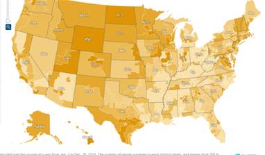
Typical problem with these maps: US states have size greatly disproportionate to their populations! For example, could trace a route from Canada to Mexico that goes through states with combined populations less than NYC (ND, SD, Mont, Wyo, Utah, NM). This is a classic method to mislead with statistics.
Next, the article states,
The New York Times asked Gallup to come
up with a statistical composite for the happiest person in America, based on
the characteristics that most closely correlated with happiness in 2010. Men,
for example, tend to be happier than women, older people are happier than
middle-aged people, and so on.
Gallup’s answer: he’s a tall,
Asian-American, observant Jew who is at least 65 and married, has children,
lives in Hawaii, runs his own business and has a household income of more than
$120,000 a year. A few phone calls later and ...
Meet Alvin Wong. He is a 5-foot-10,
69-year-old, Chinese-American, Kosher-observing Jew, who’s married with
children and lives in Honolulu. He runs his own health care management business
and earns more than $120,000 a year.
This has a few problems – although it is cute. Generally newspaper stories have the problem that stats don't sell; most people don't want to read just statistics (go figure!). But the general logical fallacy is to go from statements about averages to statements about extremes – the fact that the average of objects in A is greater than the average in group B does not imply that the maximum of A is greater than the maximum of B.
There are many applications of this – the sports team that won the final (World Series, Superbowl, NBA Champ) might not have the best single player; the country with the most Olympic medals doesn't have people in better health. Japan has higher average income than Mexico but Carlos Slim regularly makes the list of the world's richest people.
We can demonstrate this simply with Excel (going back to hypothesis testing). For example, if two samples are drawn from distributions with the same expected value, what is the likelihood that I could observe the maximum value of A being greater than the maximum value of B?
You could do this with Excel (hint hint). I will show the example with Matlab (which is a lot easier to write and not too difficult to interpret). First create 2 samples, both from Standard Normal distributions; sample A has 100 observations and sample B has 500.
sampleA
= random('norm',0,1,[1,100]);
sampleB
= random('norm',0,1,[1,500]);
Next, find the maximum of each and check if A beats B:
maxA
= max(sampleA);
maxB
= max(sampleB);
ifAgtB(indx) = (maxA > maxB);
Then do this a whole bunch more times – 10,000 times. Put this at the beginning,
for indx = 1:10000
and this at the end
end
sum(ifAgtB)/10000
The last one tells us what fraction of those 10,000 times had A greater than B. I find numbers just above 16%. Does this make sense to you? What if A had a slightly greater mean? (Experiment.)
For comparison, check the results that just look at the average of A versus the average of B,
ifavgAgtavgB(indx) = (mean(sampleA) > mean(sampleB));
--------------------
Not to pick on the NYTimes too much – they often do a good job; sometimes they do a really great job. Sometimes they make a three-spin crash and burn, as in this from the same week:
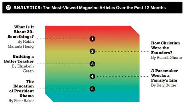
This seems to promise at least 4 dimensions of variation (x and y coordinates; the cut-off corners hint at an optical illusion of depth as well; the colors seem to imply another dimension of variation) but actually has just one dimension, without any numbers given, and in fact the rankings are so uniformly spaced as to make it improbable that they're actually proportional to page hits.
What could they have done? An x-y plot of hits by date?